Introduction
This article is about how to choose the output color space from your player and/or video processor. We’ll talk a bit about what a “color space” is, why you should care, and how to tell which color space or spaces work best with your combination of equipment.
What is A “Color Space?”
A “color space” is a way of specifying a color numerically, usually as a triplet of numbers representing positions in a three-dimensional “space” of color. Color spaces are three-dimensional because our eyes have three different kinds of color-sensitive cells (called “cone cells” or “cones”), and thus every color space in one way or another must encode three different color intensities. Most people are at least a bit familiar with the way images are formed on a computer monitor or television by combining red, green, and blue dots of varying brightness to form a wide range of colors. That method uses the most common kind of color space, the “RGB” space, named for the colors Red, Green, and Blue.
As it turns out, there is not just one RGB color space. There are an infinite number of RGB color spaces, created by varying several parameters, including the specific hue of red, green, and/or blue to be used for the colored dots in the display, the hue of white used, and the specific way the brightness of the dots in the display varies as the numbers fed into the display vary.
It’s worth noting at this point that the RGB spaces we use all the time in video and computer displays are more correctly labeled R’G’B’ (pronounced “R-prime, G-prime, B-prime”) by color scientists because they are “gamma-corrected” spaces. Color scientists reserve “RGB” to refer to non-gamma-corrected (or “linear”) spaces that use red, green, and blue primaries. This distinction is not as commonly used in the video or computer world, and is beyond the purview of this article. Just know that in this article, when we talk about “RGB” we mean R’G’B’ in the language of color science. We’ll talk about this further in a future article about gamma.
You might ask, “If we specify colors as proportions of red, green and blue, how do you specify the specific primary colors of red, green, or blue used to define the space?” The answer is that you use a fundamental color space, called XYZ, or more formally CIE XYZ. XYZ is a color space that is derived from basic studies of how the eye and brain sense color. It is notable for being an “absolute” color space (meaning that colors are specified directly, not by reference to other colors), and for being able to represent any possible real visible color that a human being can sense. RGB, by contrast, is a “relative” color space, where the colors are specified relative to three “primaries,” which are the colors of red, green, and blue used in that particular space.
There are additional color spaces that can represent any color, almost all derived from XYZ, including “xyY,” “CIELUV”, and “CIELAB”. But displays always use some form RGB as their fundamental color space, for the simple reason that real-world displays can’t show all colors. They can only show colors that can be mixed from their specific RGB primaries, so it’s not useful to send them colors they can’t display.
In the world of high definition video, there is one very common RGB space specified in an ITU standard called BT.709, or sometimes Rec. 709 (for “Recommendation number 709”). It specifies (in an absolute space) the specific colors of red, green, and blue that must be used in a conforming display, and what color of white the display needs to produce when all three primaries are at full brightness. There is no current standard for display gamma, which is how the brightness of each pixel varies as the input voltages or digital values vary, but there is a common understanding based on using the gamma of the CRTs used in video mastering.
Video and Y’CbCr
Given that video displays are fundamentally RGB devices and all share a common RGB color space, specified in BT.709, you’d expect that the primary color space used to transmit and store video would be BT.709 RGB. But in fact, even though video cameras physically measure RGB values, and displays are made using RGB primaries, video is stored, transmitted, and processed in a color space called Y’CbCr, or sometimes informally “YUV.”
Y’CbCr is the latest version of a set of color spaces that were developed in the early days of color television. The broadcasters and the FCC wanted to make color television backward compatible with black-and-white television, so all the people who owned black-and-white televisions wouldn’t find them obsolete when color broadcasting started. Unfortunately, there wasn’t enough room to broadcast both a full-color signal and a black-and-white signal within the frequency band owned by a single television station. It was necessary to find a way to send both a compatible black-and-white signal and a color add-on signal that could be combined with the black-and-white signal to produce a full color signal.
Since there was very little room in the frequency band for a color add-on signal, it was necessary to make the color add-on very low resolution. This worked out OK because your eyes are much less sensitive to color resolution than to brightness resolution. Another way of looking at it is that the viewer’s perception of how sharp the picture is depends mostly on the main black-and-white signal, with the extra color signal adding almost no additional sharpness. Thus the color signal can be, in effect, a somewhat rough and blurry overlay.
The main black-and-white signal is carried in a single channel called Y’ (pronounced Y-prime), and the low-resolution color signal is carried in two channels, labeled Cb and Cr, also called “color difference” signals, because they are derived from B-Y’ and R-Y’. Y’ itself is a weighted combination of R, G, and B, using specific weights that are designed to make Y’ approximate perceived brightness.
Y’CbCr is a handy color space for storing and broadcasting video, because the Y’ signal can be stored or sent at very high resolution, and Cb and Cr can be stored or sent at low resolution without causing the final image to look significantly worse. In effect it’s a very simple lossy compression scheme, throwing away portions of the image that are less important for perception (the detailed color information) in order to devote more resources to the important stuff (the black-and-white details).
As with RGB, there are a potentially infinite number of possible Y’CbCr color spaces, varying primarily in the proportions of R, G, and B that are combined to form the Y’ signal. The previously-mentioned BT.709 spec gives specific mathematical functions for converting RGB to and from Y’CbCr. (Standard definition video uses a different standard, BT.601, but it’s becoming less and less relevant as more content is being produced in HD or upconverted to HD.)
Subsampling
In the old days of color TV, the Cb and Cr channels (which just to be precise weren’t called “Cb” and “Cr” at the time, but that’s not important to this discussion) were reduced in resolution via an analog lowpass filter, which stripped out detail and allowed the color signal to fit in the tiny amount of broadcast bandwidth available for the extra color information. But in the digital era, the Cb and Cr signals are reduced in resolution via the simple expedient of scaling them down to a smaller number of pixels.
The process of scaling the color portions of an image to a lower resolution is called “subsampling” or “downsampling,” and scaling the color back to the original resolution is called “upsampling.” Either one can also be called “resampling.” All of these operations are identical in practice to scaling the color channels, just like scaling an image from one pixel size to another. There are a variety of different resolutions that can be stored or sent, and we often think of these various color resolution options as a different color space. This isn’t strictly true, as technically speaking the color space remains the same no matter how the color channels are scaled, but it’s still relatively common to speak of changing color spaces when one is actually changing color subsampling modes.
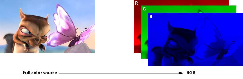
Original to RGB
A full color image can be thought of as three separate color channels: Red, Green, and Blue. This is the basic way images are displayed on any current digital monitor or television.
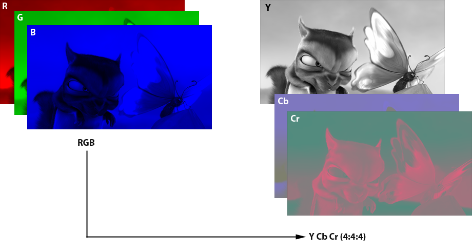
RGB to 4:4:4
The color space called 4:4:4 is a Y’CbCr color space where the Cb and Cr channels are not downsampled at all, but are stored at full resolution. The “4:4:4” nomenclature is based on a way of thinking about chroma subsampling from the old days of analog video, where sampling was potentially different for the odd scan lines and the even scan lines. “4:4:4” means that for every 4 Y’ pixels, there are 4 Cb and Cr pixels on the even scan lines and 4 Cb and Cr pixels on the odd scan lines. This format is expensive to store and transmit, so is only used for storage of very high-end professional master video. But it is often available as an output format from a player or video processor. Keep in mind that the player or video processor does not have access to the original 4:4:4 channels, but must scale up the lower-resolution 4:2:0 channels (see below).

4:4:4 to 4:2:2
For professional video, the most common format is 4:2:2, which means for every 4 Y’ pixels, there are 2 Cb and Cr pixels on the even lines and 2 Cb and Cr pixels on the odd lines. Again, it really works out to scaling the Cb and Cr by ½ in just the horizontal direction, but leaving the vertical unchanged. So each 1920×1080 image in 4:2:2 has the Cb and Cr stored at 960×1080. To display an image stored in this format, the Cb and Cr channels only need to be scaled horizontally.
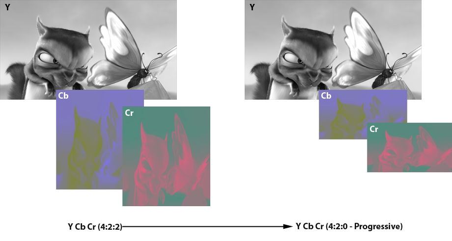
4:2:2 to 4:2:0 – Progressive
The subsampling format that is used on modern consumer video delivery media like Blu-ray Disc and DVD is called 4:2:0. This confusing designation means that for every 4 Y’ pixels on the even scan lines, there will be 2 Cb and Cr pixels and for every 4 Y’ pixels on the odd scan lines there will be 0 Cb and Cr pixels. In practice, it really means that the Cb and Cr portions of the image are scaled by ½ in both dimensions. So if the resolution of the overall image is 1920×1080, for example, the Cb and Cr portions of the image will be at 960×540 resolution. In order to display an HD image that is stored in this format, the Cb and Cr channels need to be scaled back up to 1920×1080 by interpolating values for the missing pixels, and then each pixel can be converted to RGB using the Y’CbCr->RGB algorithm specified in BT.709.
Given that all the various shiny-disc and broadcast video formats use 4:2:0 natively, one might assume that players would just send the video to the display in that format. But as it turns out, video players are basically required to at minimum convert the video to 4:2:2 in order to send it to the display, because there are standards for storing 4:2:0, but no standards for sending it to a display. While only 4:2:2 is required, many players now also offer the ability to go further and convert the video to 4:4:4, or even RGB.
And now we get to the meat of this guide. What format should you set your player to output? If you have a video processor, what format should you feed it, and what format should you have it produce? Or does it even matter?
The answer, as with so many other things in life, is, “It depends.”
The Conversion Chain
Let’s consider the process necessary to get video off a shiny disc (or from a digital broadcast or cable channel). First the video needs to be converted from 4:2:0 to 4:2:2, then to 4:4:4, then to RGB, and finally it can be fed to the display controller. This is the same process no matter what display technology is being used, whether LCD, DLP, plasma, or CRT. It’s possible to shortcut the process slightly by going directly from 4:2:0 to 4:4:4, but in practice this isn’t used very often.
If you choose to output 4:2:2 from your player to the display, then the display will need to do the scaling of Cb and Cr to generate a 4:4:4 image and then convert that to RGB. If you output 4:4:4 to the display, the display will not need to do any scaling at all, but will need to do the conversion to RGB. If you output RGB to the display, then the display can avoid all conversion steps and send the signal right to the controller. No matter which you choose, the same conversion steps are still happening; all you are choosing is which device is performing the conversion.
There’s no specific reason that a display or a player would be the optimal place to do these conversion steps. In theory doing the conversion in the display minimizes the amount of data that has to flow across the HDMI link, but in practice HDMI is more than adequate to handle any format all the way up to 4:4:4 or RGB.
So the key to choosing the right color space to output is finding out which device does a better job of converting color spaces. This is not always easy to evaluate, and it’s quite possible for one device to do a better job in one area, like 4:2:2 to 4:4:4, but do worse in another area, like 4:4:4 to RGB.
You’d think that if a display handles a 4:2:2 input signal well, then feeding it an RGB signal would be no worse, but in fact some displays do extra work when they are fed RGB, because they convert the signal back to 4:4:4 or even 4:2:2! This happens because one or more of their internal processing chips is designed only for one color format. So for these displays, sending in any format other than the one it will use for internal processing will only add extra processing and potentially degrade the image.
The same logic applies to video processors. If the processor does all its work in 4:2:2, there’s no advantage to sending it RGB or 4:4:4, and in fact there may be a disadvantage.
Unfortunately device makers tend not to reveal the exact processing steps they use internally, or the algorithms they use to convert various color spaces to RGB. Some use different algorithms depending on which color space is fed in. The bottom line is to assume nothing, and test every combination.
Performing The Evaluation
Here’s how you can decide which color space mode works best with your display and player combination, using the Spears & Munsil High Definition Benchmark. If you change any component in your system, either player, display, or processor, you’ll want to run the evaluation again. There’s no easy way to predict what will produce the best results with a particular combination of components.
Scoring Form
We’ve helpfully provided a PDF file you can download and print out, so you can try all the output modes from your player and evaluate which one works best. There is a smaller version of this same form on the back of the manual that comes with the disc.
Before you start, you’ll want to check that the settings for brightness, contrast, color, tint, and sharpness are all calibrated properly for each of the color space modes. Some displays have separate memories for every input mode, so you might find that even if the display is adjusted properly when it is being fed 4:2:2, the settings change when it gets a 4:4:4 or RGB input signal.
Start by setting the output on the player to 4:2:2. Run through the basic calibration steps for brightness, contrast, color, and tint (using the steps in the disc manual or on our web site as a guide). Then switch the output on the player to 4:4:4 and run through the calibration again. You may not need to adjust anything. If your player has RGB mode, do the calibration again for that mode. If you have even more modes, you may need to print out more forms and write in the names of the other modes you want to compare.
For the color temperature, unless you have special test equipment you won’t be able to calibrate these settings. Just make sure that these settings are set the same for all the color space modes. If your player only has one set of settings that is correct for all of the color space modes (which is the most common case), you don’t need to fill in this section. Just do the calibration once and then make sure it continues to work in the other picture modes.
Once you are sure that you have the correct settings for each input picture mode, run through the various tests listed on the form, putting a check in the box for “pass,” and leaving the box unchecked for “fail.” When you’re done, hopefully one mode will have the most boxes checked, and most of the time that will be the preferred mode to use. In some cases, you may find that one specific issue is more distracting for you than the others, and in that case you’ll want to choose among the modes that doesn’t have that particular problem.
If you can select modes in both your player and your video processor, our recommendation is to start by trying the various modes in your processor, leaving the player in factory default mode. Choose the output mode that scores best and set the processor in that mode, then move to the player and evaluate all the various modes the player can produce. If you end up changing the player’s output mode, you may want to return to the processor to re-evaluate in case the input mode affects the processor’s output. If you want to be completely comprehensive, you may want to try every possible combination of player and processor mode separately.

Player -> Display

Player -> A/V Receiver -> Display
Important note: If you are running the HDMI signal through a receiver or switcher and find problems, especially with clipping, you should try taking the receiver or switcher out of the chain and connecting the player directly to the display to see if that fixes the problem. There are several receivers, switchers, and video processors that will clip the signal passing through them, even if they aren’t doing any processing of the image. Also check the web sites of the manufacturer of your receiver or switcher to see if there is a new firmware, as this might correct some or all of the errors.
Let’s take a look at the various test patterns you’ll want to look at and what to look for in each. Most of the evaluations can be done with the Color Space Evaluation pattern, but in a few cases you might want to check another pattern for a more detailed look. There are a variety of sample images below, showing bad and good results for various sections of the color space evaluation pattern. We also show examples of what that section looks like when the upsampling is being done with a bicubic, bilinear, or nearest-neighbor algorithm. See below for more on those.
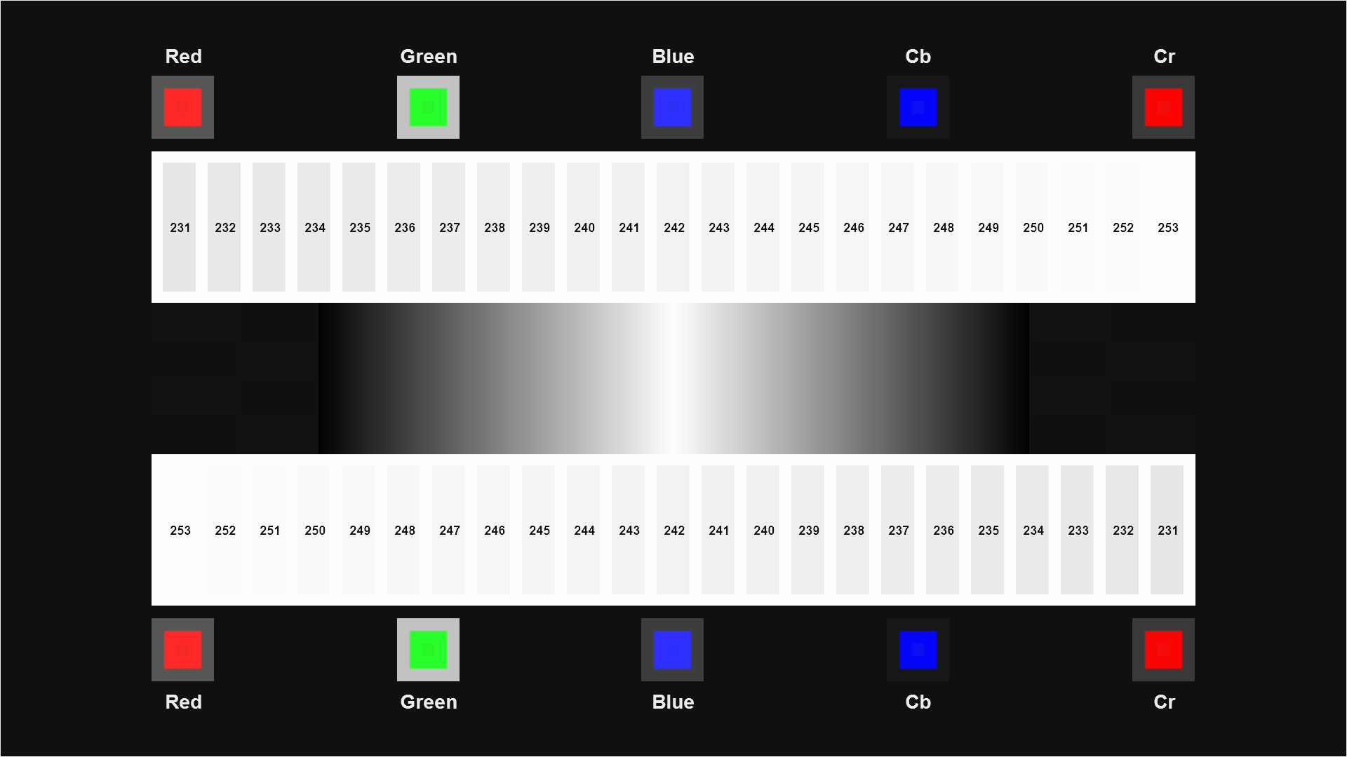
Chroma Alignment
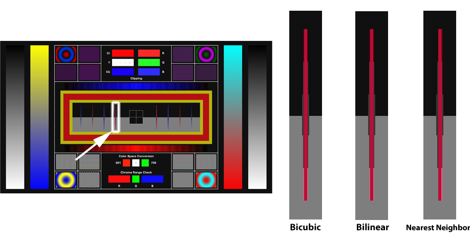
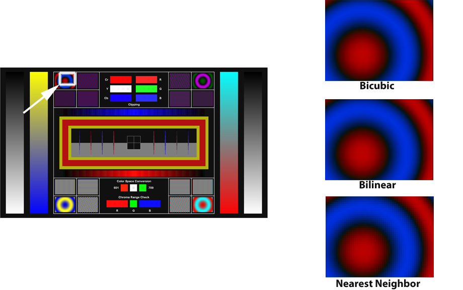
This is found in the center of the Color Space Evaluation pattern, though for more options and vertical alignment patterns you can also check the Chroma Alignment pattern. This pattern contains shapes in various color combinations that are designed to show any misalignment between the chroma channels and the luma channel. These misalignments can be caused by mistakes or shortcuts in the chroma upsampling, and it’s not uncommon to find that changing the format sent from the player to the display changes the amount of chroma misalignment.
The primary things to look at are the long thin diamond shapes on the left, right, top, and bottom of the screen. Each of them has a single straight line of chroma pixels laid on top of a long skinny diamond in the luma channel. When the alignment is correct, the chroma should be centered on the diamond, and the diamond should look completely symmetrical. Most people find it easiest to see the alignment clearly against the gray background. The difference can be quite subtle, on the order of a half-pixel shift.
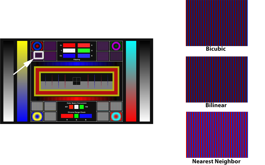
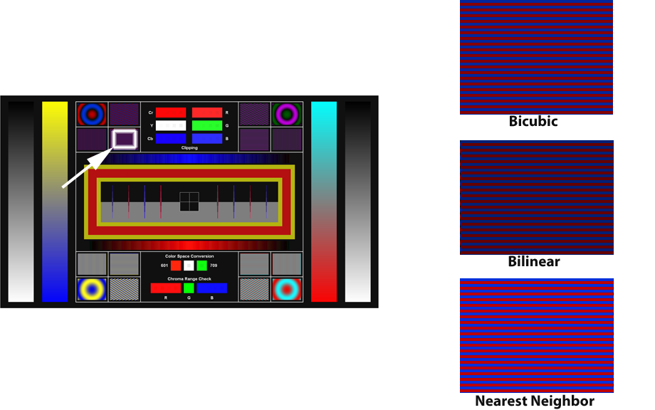
You can also often see difference (if any) in the chroma upsampling algorithm. Nearest neighbor will have very sharp chroma transitions, but will have a half-pixel shift to the right in the chroma channel. Bilinear and bicubic will produce a softer, but more accurate, chroma channel, with smoothly rolled-off edges. Don’t be fooled by the sharp look of nearest neighbor; on this pattern it often looks sharper, but it will make the finished image look jagged. See the example image to see what the various upsampling approaches tend to look like.
Put a check in the row labeled “Chroma Alignment” for any mode where the chroma lines are centered in their diamonds. If multiple modes have properly aligned chroma, put a check for all of them. If none of them are properly aligned, put a check for the mode that is the closest to correct, or for none of them if none of them are close to correct.
Also compare the image on screen to our example images for the various chroma upsampling approaches. If you’re not sure what kind of upsampling is being used, you may want to look at the bursts and zone plate patterns and compare them to our samples as well. If you don’t see clear stairstepping in any of those patterns, it’s reasonable to assume that the upsampling is using bilinear or better.
Chroma Alignment – Diamonds
Chroma Alignment – Red Stripe
High Frequency Detail
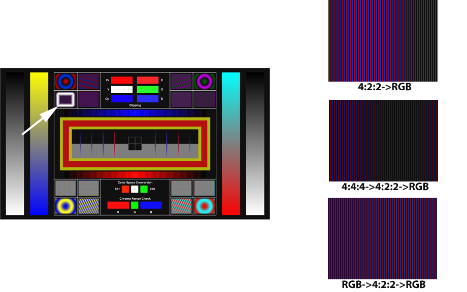
There are several sections on the top and bottom of the Color Space Evaluation pattern that have thin horizontal or vertical colored lines. These thin lines are called “bursts.” You can also look at one or more of the Chroma Bursts patterns, which have ten horizontal bursts in two rows of five on top, and ten vertical bursts in two rows of five on the bottom. The horizontal bursts show how well the video playback chain is reproducing horizontal chroma resolution, and the vertical bursts show how well the video playback chain is reproducing vertical chroma resolution.
For this section, the highest-frequency bursts (which are the only bursts on the Color Space Evaluation pattern) should have clear, bright colors that look identical to the colors in the other bursts and in the circular sections near them. If the colors are muted, or the burst looks solid gray or any other color, it shows that chroma resolution is being lost during one of the upsampling conversions. If the horizontal burst is muted, that shows a problem in the 4:2:2->4:4:4 conversion. If the vertical burst is muted, that shows a problem in the 4:2:0->4:2:2 conversion.
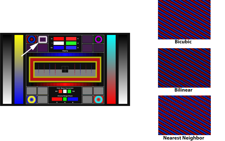
Another thing that’s fairly easy to tell from this pattern is the quality of the chroma upsampling being done. If the chroma upsampling is being done using an algorithm called “nearest neighbor” then each chroma pixel is just being copied four times to make the new upscaled chroma image. This is fast and easy, but produces blocky, jagged color contours in the final image. Bilinear upsampling uses a linear interpolation algorithm to create the replacement pixels when it scales up the chroma channel, and looks much better. Bicubic upsampling uses two cubic interpolation curves to produce a very smooth and clean chroma channel, and is generally considered the best commonly used algorithm. Take a look at our sample image to get an idea of how this pattern will vary when upsampled with different algorithms.
Put a check in the row labeled “High-frequency detail” for all modes that have clean, bright, colorful high-resolution chroma bursts. If no modes have good bursts, put a check for the mode that has the best-looking ones.
High Frequency Horizontal Resolution Burst
High Frequency Vertical Resolution Burst
 Multiple Conversions – High Frequency Horizontal Resolution Burst
Upsampling Bilinear or Better
There are three basic upsampling algorithms that are commonly used in scaling the lower-resolution chroma channels from 4:2:0 or 4:2:2 up to the full-resolution channels used in 4:4:4. “Nearest Neighbor” is the cheapest and simplest, and gives lower-quality results with jagged, blocky color artifacts. “Bilinear” is smoother, but loses some sharpness in places. “Bicubic” is a nice balance between smoothness and sharpness. The difference between bilinear and bicubic is subtle, but the difference between either of them and Nearest Neighbor is pretty easy to spot. If you have a choice, you will generally want to choose conversion that uses Bilinear or something better.
Put a check in the row labeled “Upsampling bilinear or better” if the upsampling is clearly something better than Nearest Neighbor.
Low Frequency Zone Plate
Diagonals Smooth
This section is partially a check for the Chroma Upsampling Error in video decoders, but it’s also useful for checking the smoothness of chroma upsampling. There are four diagonal chroma bursts on the Color Space Evaluation pattern that make it easy to see any jaggedness or stairstepping in the chroma channel. You can also look at the “CUE 24p” and “CUE 30p” pattern for more color combinations and a moving example. As you choose different output modes from the player, if there is a big difference between the quality of the upsampling algorithms, you’ll see the diagonals vary between smooth and jagged. The best quality upsampling will generally produce the smoothest diagonals on these lines.
After viewing this pattern with all of the different output modes selected sequentially, put a check in the row labeled “Diagonals smooth” for the mode that has the smoothest-looking diagonal lines. If they all look the same, put a check in all the boxes. You might also want to look at the diagonals and curves in the Chroma Zone Plate pattern as well. Sometimes it’s easier to see the differences on one or the other depending on the specific display.
High Frequency Diagonal Burst
Ramps Clean
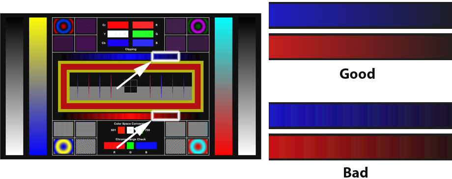
A “ramp” is a smooth gradient of color or gray that goes from one color to another or one level to another as you move across or down the screen. There are six ramps on the Color Space Evaluation pattern: two vertical ramps on each side (one luma and one chroma per side), and two horizontal red and blue ramps just above and below the chroma alignment patterns. You can also look at the various ramp patterns found in the Video Measurements->General section of the disc.
Each of the ramps should look smooth and even, with no bands or streaks anywhere along it. The two ramps in the center should not have a wide solid colored area in the center, but should vary from black to full red or blue at a thin peak in the center and back to black.
After looking at the ramps in each color space, put a check next to “Ramps clean” if the ramps look smooth and even with no bands or streaks.
Banding
Clipping
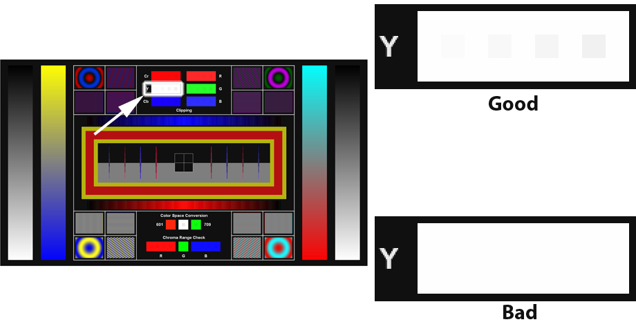
This section in the top center of the Color Space Evaluation pattern tells you if any of the primary color channels is being clipped above the reference white level at any point in the chain. There are some popular HDMI transmitter chips that clip the Y’ channel when converting 4:2:2 to 4:4:4 or RGB, so when using a player with one of these chips, setting the player to output anything other than 4:2:2 produces a hard clip in the Y’ channel. A telltale sign of this is that the Y’ (white) channel is clipped, but the red, green, and blue channels are not clipped, or at least not completely clipped.
Put a check in the row labeled, “White not clipped” if the white portion of the pattern shows four smaller squares inside the solid rectangle.
Put a check in the row labeled, “Chroma not clipped” if the Cb and Cr portions of the pattern show four smaller squares inside the solid rectangle.
Put a check in the row labeled, “Red, green, and blue not clipped” if the red, green, and blue portions of the pattern show four smaller squares inside the solid rectangle.
Clipping
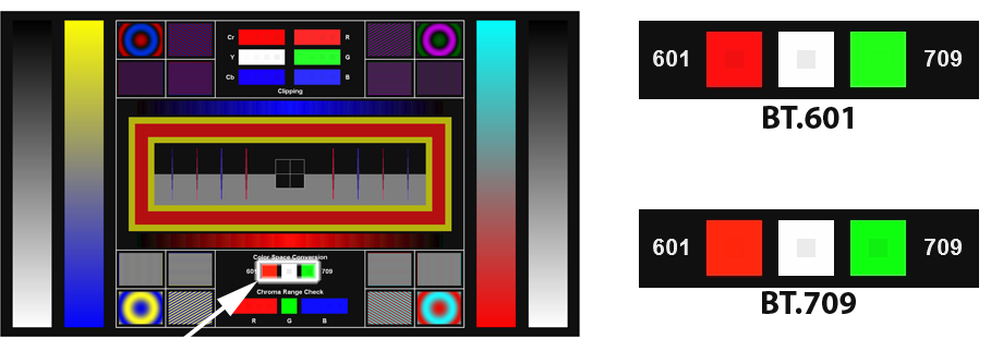
BT.709
All HD video should be using the equations specified in the HD video spec, BT.709. Some components may incorrectly use the equations from the older standard definition spec, BT.601. On the bottom center of the Color Space Evaluation pattern are three boxes that help to determine if the correct conversion is being used. In order for the pattern to work, the Y’ channel must not be clipped, so for convenience the center box allows you to check for Y’ clipping. If you can’t see a smaller box inside the center white box, then this pattern section won’t be accurate. Just skip over it and don’t try to score it.
Assuming the signal is not being clipped, then either the red box or the green box but not both should have a smaller box showing in the middle. The red box can be very hard to see, so you may need to get close to the screen to see it. If there is a smaller box inside both the red and green boxes, there is some kind of odd error, which should be treated as a “fail.”
If there is a smaller box inside the green box, the correct BT.709 conversion is being used, and you should check the box in the row labeled “BT.709”
If there is a smaller box inside the red box, the incorrect BT.601 conversion is being used, and you should leave the box blank in the row labeled “BT.709”
BT.601 vs. BT.709
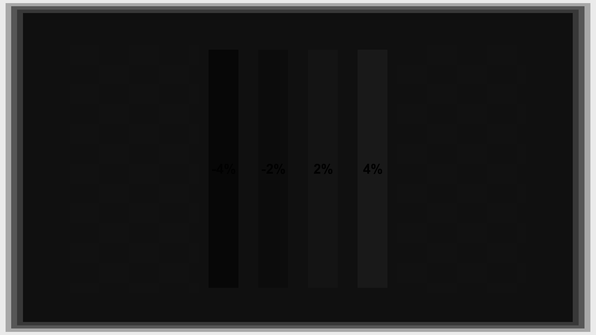
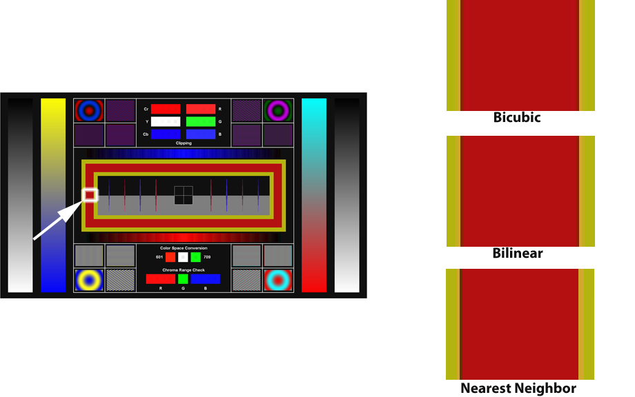
Chroma Range
This test is for an odd error found in some conversion chips that produces incorrect colors. The test is at the very bottom center of the Color Space Evaluation pattern. If you don’t want the technical details of the problem, skip down to the scoring rules.
The Gory Details
The issue is that some chips shortcut the calculation by not converting to the nominal [1..0] range, and the range is different between Cb/Cr and Y. But the coefficients are intended to work with the nominal range scaled to be the same for all three values. In other words, these equations are not identical (where “K1” is the Cb matrix coefficient and “K2” is the Cr matrix coefficient, and the Y coefficient is assumed to be 1.0):
Incorrect:
Eq1: R = Y + (Cb – 128) * K1 + (Cr – 128) * K2
Correct:
Eq2: R = (((Y – 16) / 219) + ((Cb – 128) / 224) * K1 + ((Cr – 128) / 224) * K2 ) * 219 + 16
The top one is close to a simplification of the bottom one, but ignores the difference between 219 and 224. At moderate values (close to gray), the differences are small, but at extreme values, the error gets large.
A correct simplification is:
R = Y + (Cb – 128) * (219/224) * K1 + (Cr – 128) * (219/224) * K2
In practice the Cb and Cr coefficients are just adjusted by the 219/224 fraction. Properly implemented, it doesn’t actually require any extra calculation.
Scoring
Put a check in the box in the row labeled “Chroma range” if the red rectangle has four smaller squares visible inside it, the green square has a smaller square inside it, and the blue rectangle has four smaller squares inside it. These squares are very faint; you need to look closely to see them.
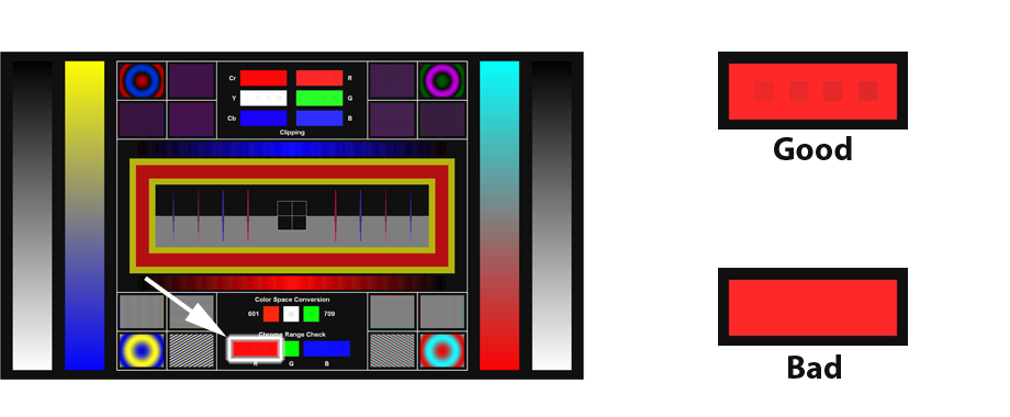
Chroma Range
Finishing Up
Once you’ve run through the whole set of test for each of the available modes, look to see which mode has the most checkboxes filled. If there are several that tie for most boxes, you may want to look carefully at the artifacts on the Color Space Evaluation pattern and consider which of them you find most annoying. Some artifacts may be easily visible from your seating location, for example, while others are not. You should use a color space that avoids the most visible or annoying artifacts for you.
If there are multiple spaces that have essentially identical scores, our usual preference is to send 4:2:2 to the display as a default, just because it matches the format used by most processing chips, and is therefore less likely to undergo extra conversions in the display.
That’s it! Make sure you’ve reset the settings to the values you wrote down originally for your selected color space, and enjoy the video.