The Color control (sometimes called “Saturation”) is used to adjust the relative balance between the chroma (color) channels and the luma (brightness) channel. If Color is set too high, the colors on screen will be oversaturated, and if it’s set too low, the colors will be muted and washed out. The Tint control (sometimes called “Hue”) is used to adjust the balance between the two chroma channels. If Tint isn’t set correctly, all of the colors on the display will be wrong.
First let’s cover some background about color and video, including why we need Color and Tint adjustments and what, specifically, they adjust. If you just want to know how to use the Color And Tint pattern to set Color and Tint, skip ahead to the section called “Using the Color and Tint Pattern.”
History and Background
The very first television signals were black and white. When color was added to television in the 1950’s, the FCC and the networks wanted to keep the new color signal compatible with all the black-and-white televisions that people already owned. The problem was that the original television signal was designed to send a single channel of information, but producing a vivid full-color image requires three channels: one channel each for red, green, and blue. Given that the original television signal used all the available information-carrying space for its single channel, It seemed impossible to add two more channels, much less keep the signal compatible with everyone’s existing sets.
The clever solution was twofold. First of all the engineers realized that rather than sending completely separate color and black-and-white signals, they could just add two color-difference channels to the black-and-white channel, and then recombine those three channels into the R, G, and B channels needed for color display.. They combined red (R), green (G), and blue (B) into a luminance, or brightness, channel (called Y for historical reasons), a B-Y channel (called U or Cb depending on the context), and a R-Y channel (called V or Cr). On the other end, the television would convert B-Y to B by adding Y to it, and R-Y to R the same way. Then G could be recovered because Y is a simple weighted combination of R, G, and B, so G is just Y minus a small amount of R and B. The old televisions could just display the brightness (Y) channel, which makes a perfectly viewable black-and-white picture by itself.
The second part of the solution was figuring out that there was a small bit of bandwidth left over in the transmission signal that the original video engineers didn’t consider, and that would be ignored by the old televisions. However, the extra signal space couldn’t carry nearly as much picture resolution as the main signal. So the color channels needed to be much lower quality. This works out reasonably well because the perception of sharpness in the human visual system is primarily related to the sharpness of the luminance channel. In essence our visual system has more brightness resolution than color resolution.
So at the television studio, the cameras are sensitive to R, G, and B, but those three signals are fed into a converter that outputs Y, Cb, and Cr. The Cb and Cr signals are sent through a lowpass filter to compress their bandwidth, all three signals are multiplexed together into a single channel called “composite” video, and the signal is transmitted over the air.
At the television, the composite video signal is demultiplexed (which is a whole complicated topic in itself). This recovers the Y, Cb, and Cr channels, or a close approximation, and the three channels are fed into a decoder that converts them back into R, G, and B, which is then fed to the display driver circuitry. It’s also possible to feed the display a separated “component” signal (using three separate wires), or a partially separated YC (often called “S-Video”) signal, where the Y signal is on one wire and the Cb and Cr are carried in multiplexed form on the other wire. But broadcast analog TV has always been in composite form.
The problem is that in the process described above, many things can happen to degrade or change the Y, Cb, and Cr signals. Age of the various pieces of equipment, heat, minor variations in components and so forth can all cause the various signals to vary in amplitude, and not necessarily the same amount for each channel.
The solution the original video engineers created was to put Color and Tint controls on the display to allow users to correct for mismatches in overall amplitude of the three channels. Broadly speaking, the Color control raises and lowers the level of the Cb and Cr channels relative to the Y channel. This can correct errors where Cb and Cr are both too high or too low by the same amount. The Tint control rotates the Cb and Cr values around the origin of a 2D space. If this seems complicated, just think of it as changing the amplitude of the Cb and Cr channels relative to each other, which is what the effect is in practice.
With the advent of digital video, it would seem like Color and Tint wouldn’t be necessary, since the things that can mess up the amplitude of the various signals are really only found in analog video. Digital video sends the signal to the display as a series of numbers, and is essentially immune to variations caused by temperature or age of the electronic components. In practice, it’s not uncommon for televisions to have the Color set too high at the factory, simply because users like bright, saturated colors. And when a buyer is comparing a wall of televisions at the local electronics store, a properly calibrated TV might look washed out compared to a TV next to it with the Color control turned up. So manufacturers have an incentive to mis-set Color. Tint, on the other hand, is rarely mis-set at the factory. It does sometimes happen, and sometimes it gets mis-set accidentally by someone trying to “fix” the picture, so it’s worth checking it to be sure.
So to sum up, with one control that adjusts the amplitude of Cb and Cr relative to Y (Color), and another that adjusts the amplitude of Cb relative to Cr (Tint), essentially any simple amplitude error of the three channels relative to each other can be corrected. But how do you know whether there’s an error, and how do you know when that error has been corrected? That’s where the color bars come in.

Color correct*

Color too high*
Color too low*
Color Bars: The Theory
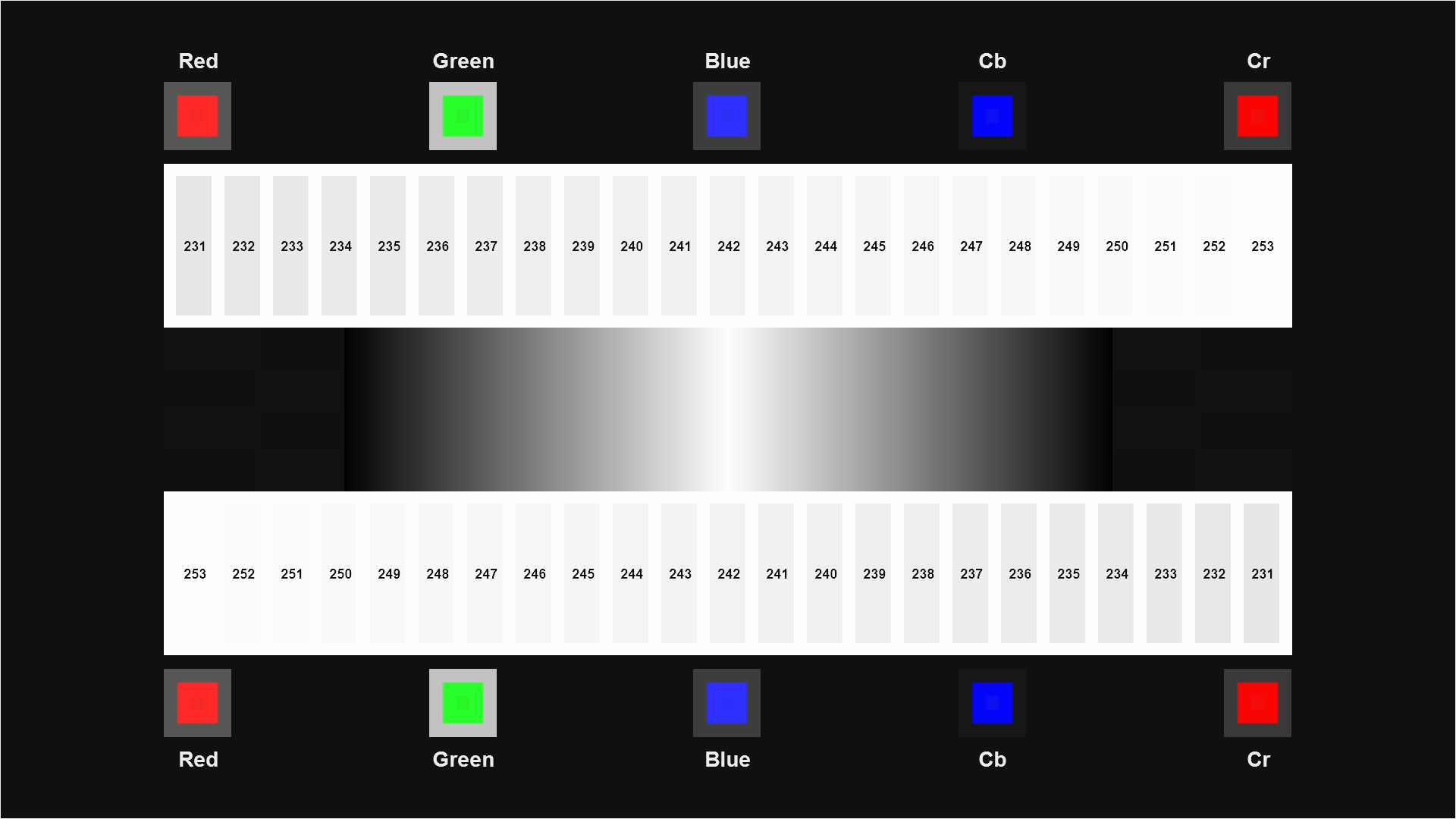
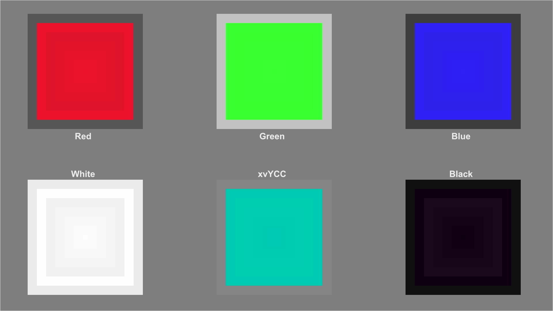
The Color Bars pattern is the classic pattern for setting the Color and Tint controls on a color TV. On this disc, we’ve created a new pattern called Color and Tint that is easier to use, but it’s useful to consider the original pattern first to understand the basic idea. Color Bars is a conceptually very simple pattern. It consists of all the primary and secondary colors, plus white, all encoded at the same levels. The specific level used could be any level up to 100% reference, but is usually 75% of reference, to ensure that it’s high enough to be clearly visible, but not so high that clipping or display nonlinearities at the extremes will affect the calibration. So the solid colors like red, green, and blue have a single channel at 75% and the other two channels at black (0%), the secondary colors (cyan, magenta, and yellow) have two channels both at 75% and the remaining channel at 0%, and white has all three channels at 75%. Those bars are converted to Y, Cb, and Cr using an encoder with a known-correct encoding algorithm, so if your display is set correctly and the signal hasn’t been modified, the bars should be decoded on the other end at 75% across the board.
If something has happened to both chroma channels and they’re too high, then all the primary and secondary colors will be at a level higher than 75%, while white will remain at 75%, because white is encoded using just the Y channel (Cb and Cr are zero), but the colored bars contain non-zero Cb and/or Cr. Thus amplitude errors in Cb and Cr will change the colored bars, but not the white bar. The same logic applies if the chroma channels are both too low: the colors on screen will display at a level lower than 75%. If the Cb channel is too low and the Cr channel is too high or vice-versa, that’s a Tint error, and in that case the blue bar will be lower than 75% and the red bar will be higher than 75% (or vice-versa), while again white will stay correct at 75%. (This is a bit of a simplification: in fact the Tint control doesn’t merely change the amplitude of Cb and Cr relative to each other; it rotates the Cb and Cr values around the origin in the Cb-Cr plane. But the practical effect is to change the Cb and Cr values relative to each other in a non-linear fashion.)
So the basic idea of calibrating Color and Tint using Color Bars is to isolate one channel (traditionally blue, but it can be any of the three) and check that all the bars in the pattern that contain any blue have exactly the same level of blue. If they don’t, you adjust Color and Tint until they all look the same. Typically you adjust Color by comparing the blue bar to the white bar (conveniently located one above the other in the pattern), and then Tint by comparing the magenta bar to the cyan bar (again, located one above the other), but in practice adjusting Tint any significant amount will necessitate readjusting Color (and possibly vice-versa), so you may need to move back and forth between Color and Tint until the bars look correct.
Color Spaces for SD and HD
The (relatively) straightforward process mentioned above has one fairly large caveat: there isn’t just one equation for converting R, G, and B to Y, Cb, and Cr (and back). There are two. Standard Definition (SD) video is converted using the equations in the BT.601 standard, while High Definition (HD), are converted using the equations in the BT.709 standard. This seems pretty straightforward – if the video is standard television resolution (480 vertical lines, or 576 in Europe), use BT.601, and if it’s higher (720 lines or more), use BT.709. And in fact that’s exactly how most displays make the decision as to which equation to use.
Where things get complicated is the relatively common “upscaling” DVD players, and some other equipment that will scale standard definition signals to high definition. These devices rarely remap the colors from BT.601 to BT.709, with the result that the display will be getting a signal that should be decoded using the BT.601 equation, but instead it uses the BT.709 equation, making all the colors slightly wrong. They aren’t wrong enough to be obviously bad, but they aren’t the intended colors. Some colors get more saturated; some get less saturated. Some colors shift in hue.
It’s very difficult to tell whether the video you’re watching was decoded with the wrong equation, unless you have special test equipment or are extremely familiar with what the picture looks like on a known-good system. There is a quick test you can try: If you have an upscaling DVD player or video processor, and have an SD test DVD, you may want to try viewing a standard definition Color Bars pattern through a blue filter both with and without the upscaling feature turned on. If the relative brightness of the color bars when viewed through the filter is different when you turn on the upscaling, then that’s a sign that your device is not converting the color space when doing the upscaling, and you will get more accurate color feeding your display a standard definition signal.
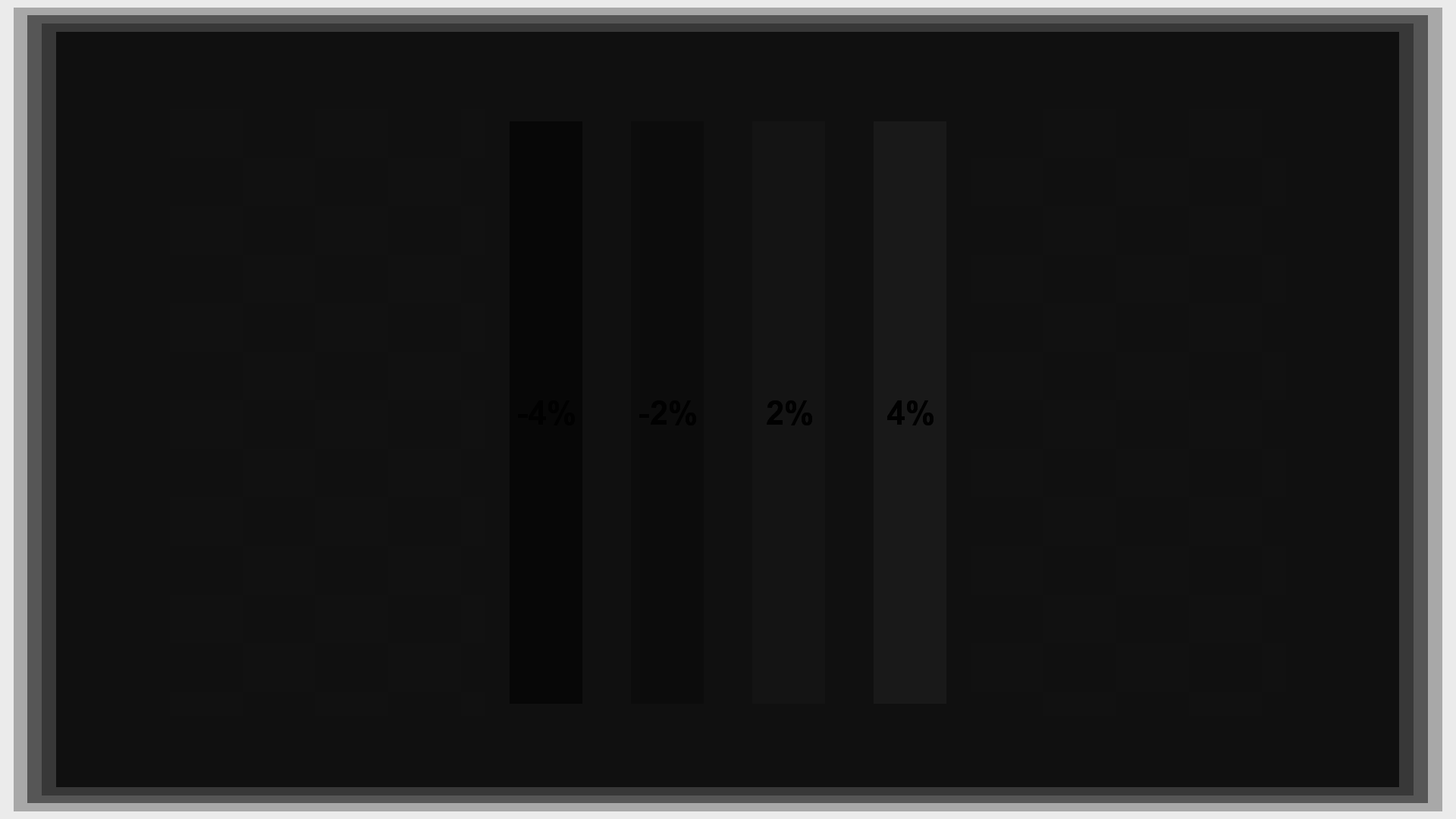
The Clipping pattern is another way to see if BT.601 is incorrectly being used instead of BT.709, assuming the signal isn’t being clipped. First set brightness and contrast properly, then look at the Clipping pattern. If BT.709 is being used and the signal is not clipping, all four boxes should contain concentric squares. If the green box looks solid (indicating that green is clipped) and the white, red, and blue boxes show the concentric squares (indicating that they are not clipped), that’s a strong indicator that BT.601 is being used.

Clipping correct (BT.709)
Clipping incorrect (BT.601)
How Color Management Changes the Equation
Many modern displays include a Color Management System (CMS), which is designed to remap the native color gamut of the display to the video standard color gamut (BT.709). In the past, most displays simply used filters or phosphors that were close to the standard primary colors specified by BT.709 or one of the earlier specifications like SMPTE-C. All of the previous color standards were close enough to each other that the small color errors caused by viewing content on a SMPTE-C monitor when it was designed for BT.709 were not worth worrying about.
But quite a few modern displays have color gamuts that are significantly larger than the standard gamuts specified for video. These displays are ready for newer wide-gamut encoding standards like xvYCC which allow for more saturated and vivid colors. However, 99.9% of real-world video via DVD, Blu-ray Disc, Cable, etc. is encoded using the existing standard color gamut. This content can’t be displayed accurately using a wide-gamut display without a CMS. People definitely like extra color saturation, but it’s possible to get too much of a good thing.
The solution adopted by many wide-gamut display manufacturers is to include a CMS that automatically remaps the input colors into the native color space of the display, so they’ll come out looking like they should. This has the unfortunate side effect of making the color bar pattern no longer work with a blue filter. The problem is that after remapping, the R, G, and B values may not be 75% any more, and they’ll vary widely depending on the actual native gamut of that specific display. It’s impossible to make a single color bar pattern that will work for all displays, at least when using a colored filter or blue-only mode.
To tell if your display has a CMS, look through the on-screen menus for labels like “CMS”, “Advanced Color Management,” “Six-axis Color,” etc. If you find a mode that allows you to move the color of your Red, Green, and Blue primaries, then your display has a CMS. If you find a menu that allows you to change Gain and Bias of the three primaries, or Brightness and Contrast for the three primaries, that’s not a sign of a CMS, because those controls don’t change the color of the primaries. They change the relative color of white, which is a subject for another article. But if you find a menu that allows you to change Color and Tint, Saturation and Hue, or ‘x,’ ‘y’ or ‘Y’ for each of the main primaries, that’s a sign of a CMS.
If none of the menus mentioned above appear, look through the manual for references to “Deep Color,” “xvYCC,” or “Active Color Management,” or variations thereof.
If the display has a “CMS off” mode, you can turn it off temporarily, calibrate Color and Tint using a blue filter, then turn it back on.
If the display has a “blue-only” mode, the blue-only effect will almost certainly be applied after Color & Tint, but before the CMS. If the display has a CMS on/off control, try looking at the Color and Tint pattern with blue-only mode on, and CMS both off and on. There should be no difference. If there is no difference you can adjust Color and Tint without worrying if the CMS is on or off. Just turn on “blue only” mode, calibrate Color and Tint, then turn it off again. No filter is necessary.
If the display has neither of these things, then you probably will need to hire a professional calibrator to get absolutely perfect settings, because it will very likely require special equipment to set color and tint exactly. In addition, a professional calibrator may be able to adjust the CMS settings to make sure you’re really getting accurate color. In some cases display manufacturers will deliberately adjust the CMS to increase the saturation slightly, to make their display look better than the others in the showroom. A calibrator can usually correct this.
Another option is just to leave the Color and Tint controls alone. It’s fairly rare for Tint to be set incorrectly at the factory. In some cases Color will be set too high at the factory. If you are bothered by extra-bright and saturated colors and have a display that can’t be easily calibrated because of a CMS, you might consider taking the Color control down a few notches until the picture looks more pleasant.
Another useful tip is that when a CMS is active, it will generally cause the Blue channel to be dimmer or at least no brighter than the White channel when the monitor is properly calibrated. If your Blue channel is brighter than the White channel on the Color Bars pattern when you use the blue filter (see below for instructions on using the blue filter), then the Color control is almost certainly too high. You can safely lower it until the Blue and White bars match on the Color and Tint pattern. It still may be too high, depending on what the real gamut of your display is, but it will be closer to calibrated than it was before.
Using the Color and Tint Pattern
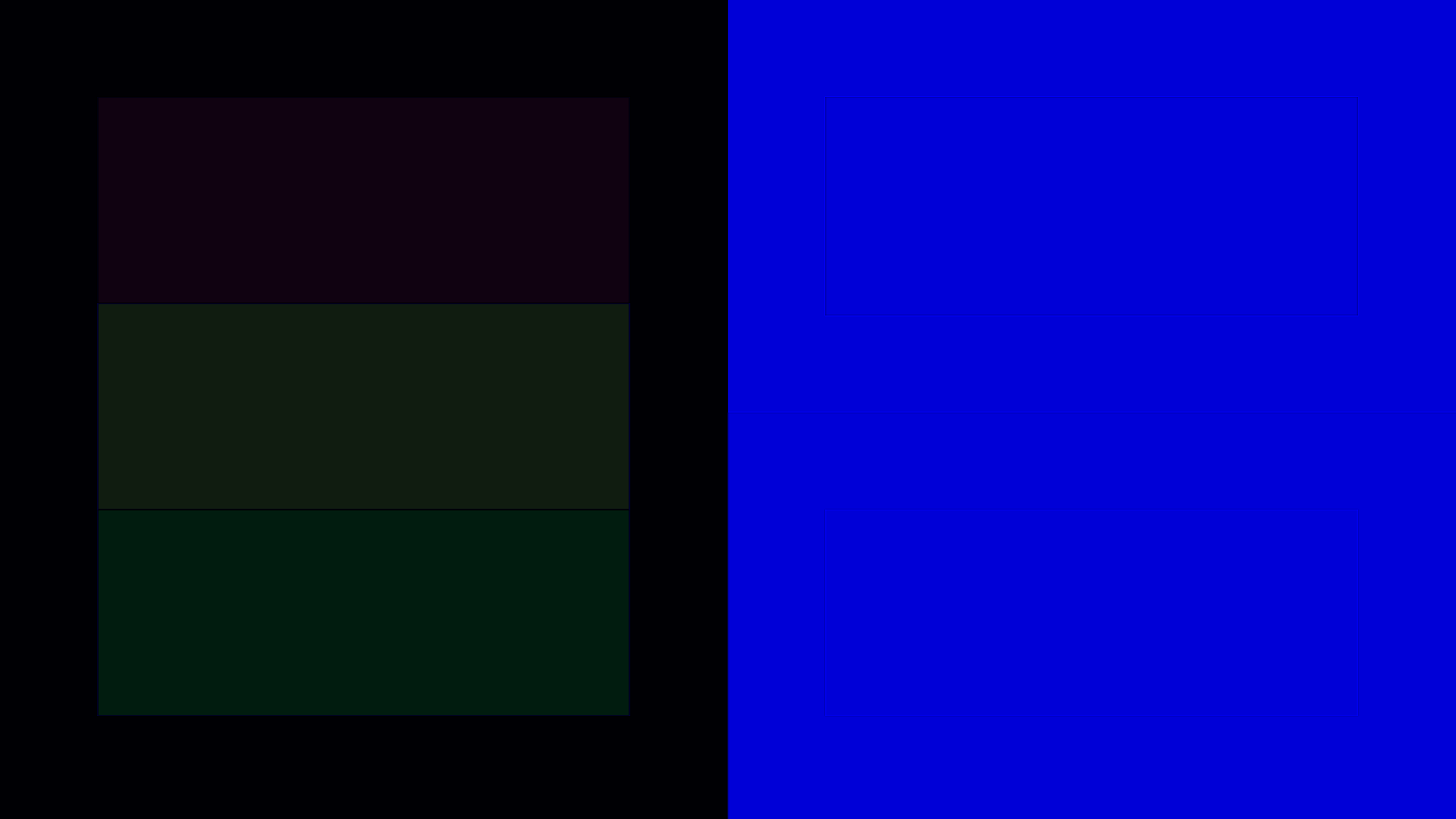
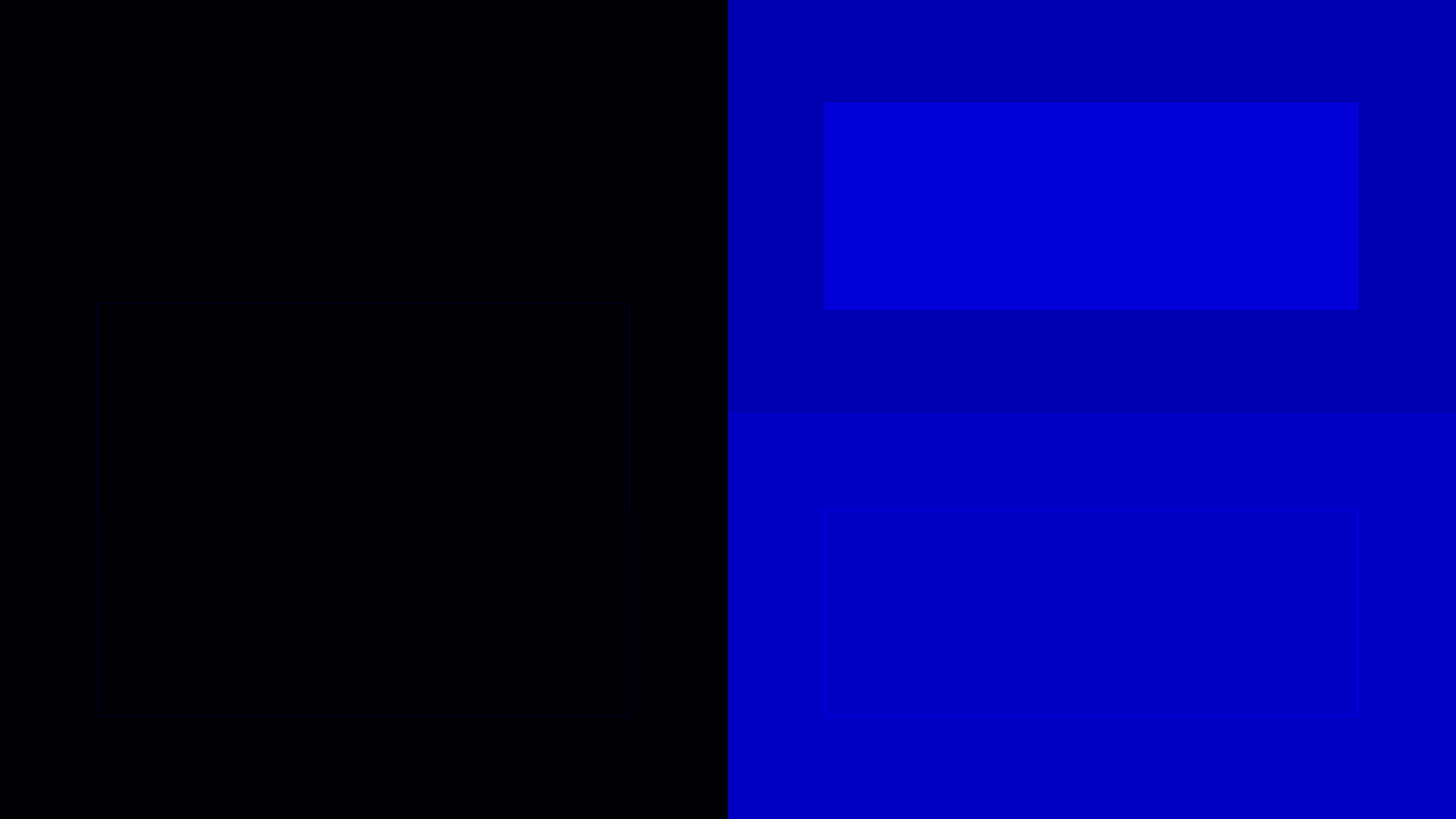
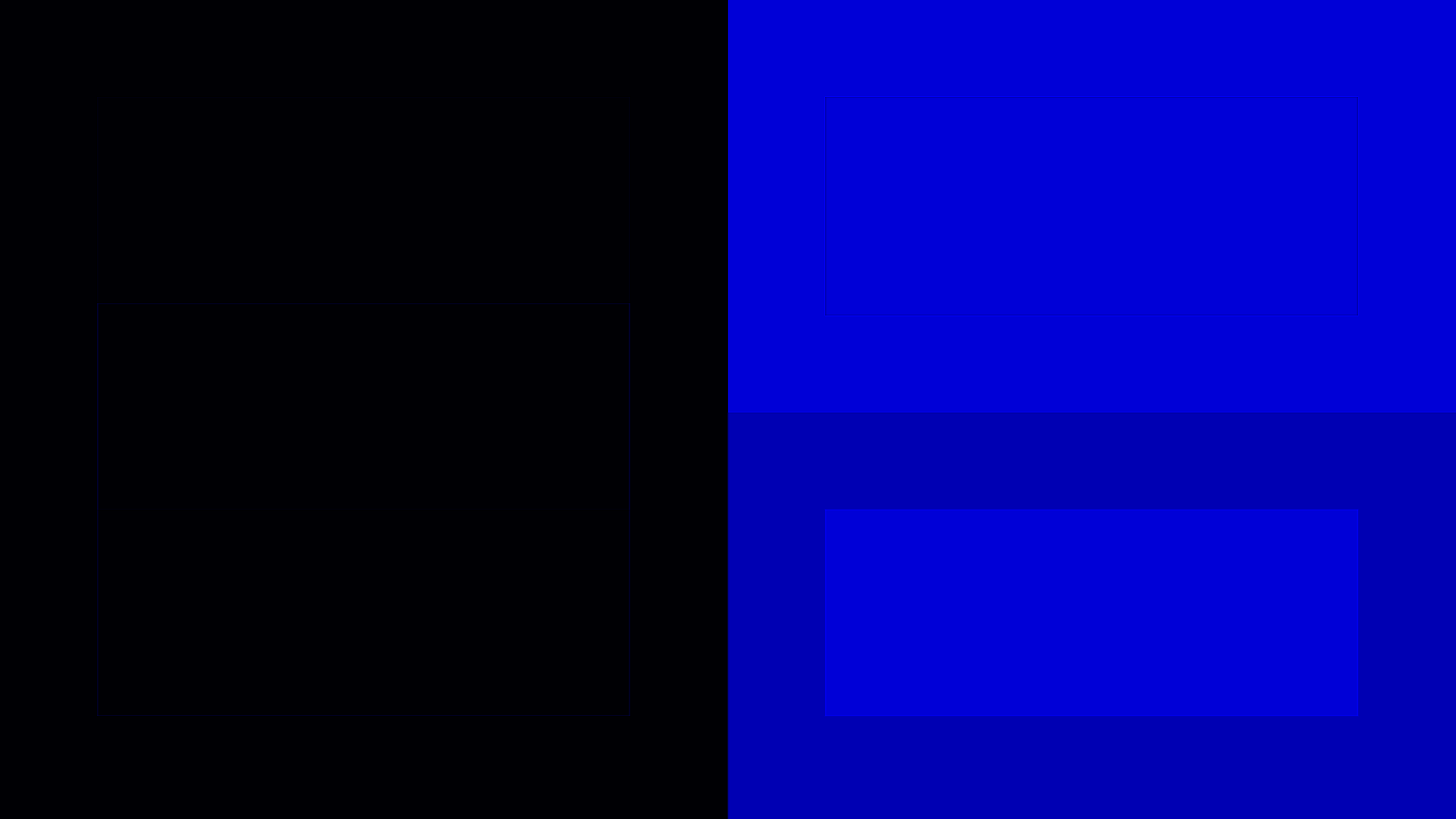
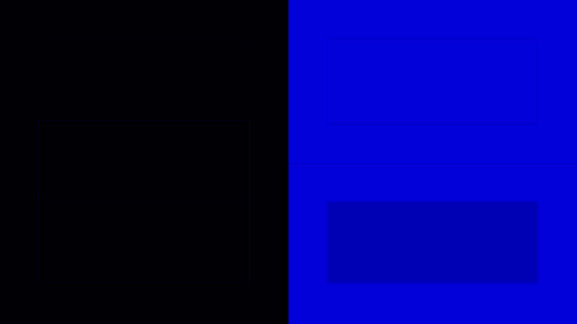
Compared to the Color Bars pattern, the new Color and Tint pattern makes the process of setting the Color and Tint controls easier by grouping the important colors together so there’s no ambiguity about what you should be looking at in each stage of the calibration. When the pattern looks correct, the left half the screen is solid black and the right half is solid blue when viewed through a blue filter or with the display in blue-only mode.
To follow these instructions, you’ll either need a blue filter designed for video calibration or be able to put your display into “blue channel only” mode. The “blue only” mode is the best, but not many modern displays offer this mode. If you need to use a filter, we recommend using the Spears and Munsil Calibration Filter, which is the only one that allows you to choose the filter strength appropriate for your display.
If you’re using a filter, you need to be confident that your display is not a wide-gamut display with a CMS, or that you are able to turn the CMS off. If you’re not sure, read the section above called “How CMS Changes The Equation.”
Put up the Color and Tint pattern. Either put the display in “blue only” mode or look through the filter at the display. If you are using the Spears and Munsil Calibration filter, start with the 1X side.
First check that the filter is working properly with your display. When looking through the filter the red, green, and yellow bars on the left should become completely black, and should be the same brightness as the black area around them. If they don’t turn absolutely black when you look through the filter, then that filter (or that strength level on the Spears & Munsil filter) will not work with that display.
If you’re using the Spears and Munsil filter and the 1X filter isn’t working, look through the 2X side and again check to see if the red, green, and yellow bars turn black. If they don’t, fold the filter in half to create a 3X filter and try again. If the red, green, and yellow bars don’t turn black even with the 3X filter, then a perfect calibration won’t be possible, but unless the bars are quite visible it’s still probably worth doing the calibration. If the filter won’t work with your display and you want to get the settings absolutely perfect you might consider contacting a professional calibrator, who may be able to calibrate color and tint (among other things) using a spectroradiometer or colorimeter.

Color Bars – Correctly Filtered
Color Bars – Incorrectly Filtered
Once you have verified that you have a working filter, look through it and compare the large blue rectangle on the upper right to the white area around it. They should look identical when viewed through the filter. If the blue bar is brighter than the white area, turn the Color control on the display down. If the blue bar is not as bright as the white bar, turn Color up.
Now compare the large cyan bar on the lower right to the magenta area around it. They should look identical when viewed through the filter, and should match the blue and white areas above them. Adjust the Tint control on the display up or down to make the bars match.
You will want to bounce back and forth between adjusting Color and Tint until the whole right side of the screen appears the same brightness through the filter.
You should keep in mind that large adjustments of the Tint control are almost never required unless someone has been messing with the display before you got to it. These days the factory Tint settings are usually right on the mark or close to it. So if you are moving the Tint control more than a notch or two, you may want to recheck the instructions, or perhaps assume that your display has a CMS that is throwing off the calibration. It’s always possible that the Tint control really is way off, but eliminate any other possibilities before proceeding with any large changes.
You should also know that the Color control is almost always either correct or too high in the factory default settings. Manufacturers have been known to set Color too high at the factory, but never too low. People do like extra color, but no one likes less color. It would be strange for a manufacturer to deliberately reduce the color below normal at the factory. If it appears to be too low, then you may want to recheck the instructions, or you may be seeing the effects of a CMS. Again, it’s always possible that the color is actually set too low, but check all other possibilities first.
Color and Tint correct
Color too high

Color too low
Tint too high
Tint too low
Using the Green and Red Versions of the Color and Tint Pattern
If you happen to have a display that has a red-only and/or a green-only mode, or you have usable green or red filters, you can also calibrate or cross-check the Color and Tint controls by using the Color and Tint Red and/or Color and Tint Green patterns, found in the Advanced Video->Setup section. These patterns are identical to the standard Color and Tint pattern (called “Color and Tint Blue” in the Advanced Video->Setup section), but are designed to be used with a different filter or display mode. Follow all the same instructions given above, including checking for proper filtering. A fairly good red filter can be had by using the red side of the red/cyan 3D glasses that are packaged with 3d comic books and magazines. You may need to stack two or three thicknesses of glasses to get a filter that will work with your display. Green filters are much harder to make work. On many displays it is impossible to use a green filter to calibrate Color and Tint because there is no portion of the green spectral emission curve on that display that isn’t overlapped by its red or blue curves or both. The key is to check the bars on the left and make sure they turn black when you look through the filter. If that happens, the filter is working.
If you find that you get different results for Color and/or Tint when using the Red or Green versions of the pattern than you do with the standard Blue version, that suggests that the color decoding matrix on your display is not correct. Most commonly the manufacturer has altered it to add extra red to the image. This helps sell TVs at electronics stores, where a TV that is deliberately extra red often looks superficially better than another TV nearby that has correct color. If your TV has this problem, we recommend splitting the difference between the two numbers you come up with between the Red and Blue versions of the pattern.
Conclusion
In the end, it’s a very simple operation. Once you know what to do you can calibrate color and tint in a couple of minutes – perhaps longer if you really want to get everything just perfect.
Next up: Choosing a Color Space.
*Photo by D Sharon Pruitt used under Creative Commons license.