This is an in-depth guide to the Contrast control: what it is, why it’s important, and how to set it properly. If you want all the nitty-gritty of history and theory, read on. If you just want the detailed instructions, skip ahead to the section called “Using the Contrast Pattern.”
History and Background
The Contrast control is used to set the overall luminance of the display to the appropriate level. Another word for “luminance” is “brightness,” which is why it’s confusing that the control that adjusts luminance is called “contrast” and not “brightness,” but those are the names the original video engineers gave the controls.
To understand the name, let’s start by defining “contrast.” In the video realm, contrast is the ratio between a bright reference value (“white level”) and a dark reference value (“black level”). It’s almost always given in ratio form with “1” as the denominator, as in “100:1” or “1000:1”. A contrast ratio of 100:1 means that the brightest parts of the screen are 100 times brighter than the darkest parts. In theory, the black level is supposed to be absolute black (0 luminance), which would result in an undefined, or “infinity:1” contrast level. In practice, all real displays have some residual brightness even when they’re supposed to be showing black. Even if the display itself doesn’t produce any light, there’s always some amount of ambient light or light reflected from the brighter parts of the image off the walls of the room and back onto the screen. Since the residual black level is usually close to constant, raising the white level also raises the overall contrast ratio, which is the basic reason the control is called “contrast.”
What the Contrast Control Does
First consider the Brightness control. As mentioned in our article, the Brightness control adds or subtracts some amount to/from the onscreen levels. Raising the Brightness control is the equivalent of adding light to every part of the screen equally. Contrast, on the other hand, is a multiplier. It multiplies all the light levels on the screen by some amount near 1.0. The result is that if you raise the Contrast control, the brightest parts of the screen get much brighter, the medium-bright sections get somewhat brighter, and the darkest parts don’t change much at all. This is handy, because it allows you to raise and lower the highest brightness level (the “white level” we mentioned before) without changing the black level, because 0 multiplied by anything is still 0. And all the levels in between 0 and 100% just move up proportionally, leaving the overall image looking essentially the same, but brighter. And because the black level didn’t change, and the real practical “black” on the screen is never really absolute black, by raising the white level you also raise the contrast.
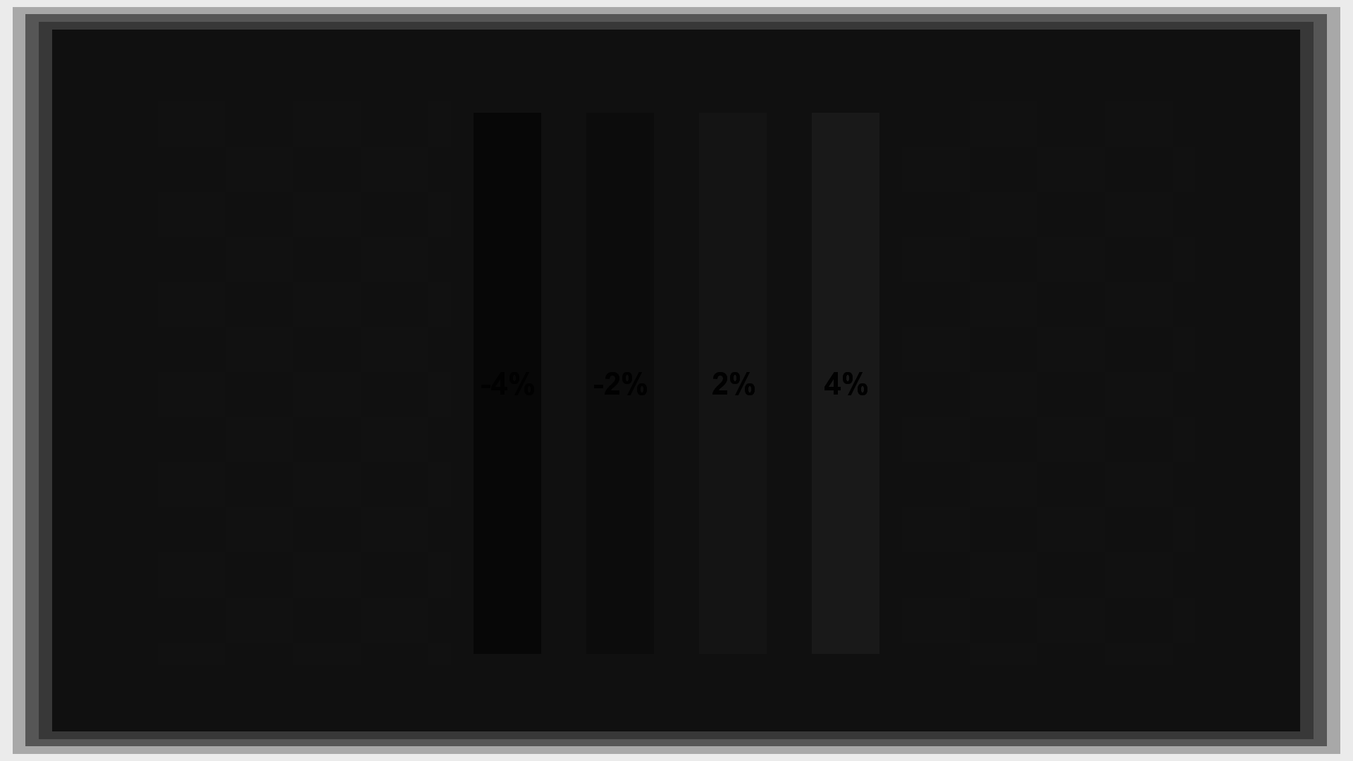
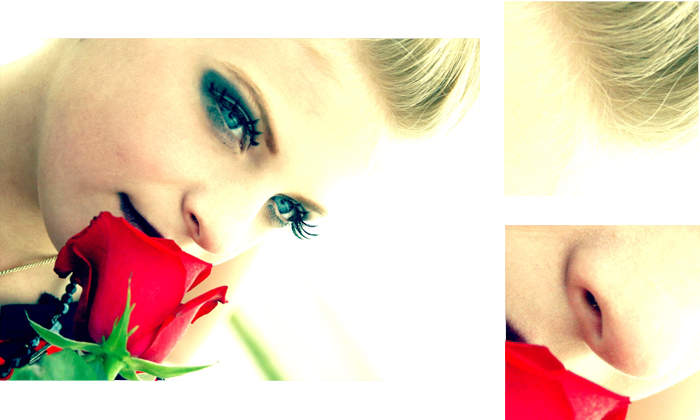
The following image is the same one used in the article about the Brightness control. If you compare the effects of change Brightness to changing Contrast you’ll note that the Contrast control raises and lowers the level of the brightest parts of the image, but leaves the dark areas mostly unchanged.
Contrast correct*
Contrast too high (clipped)*
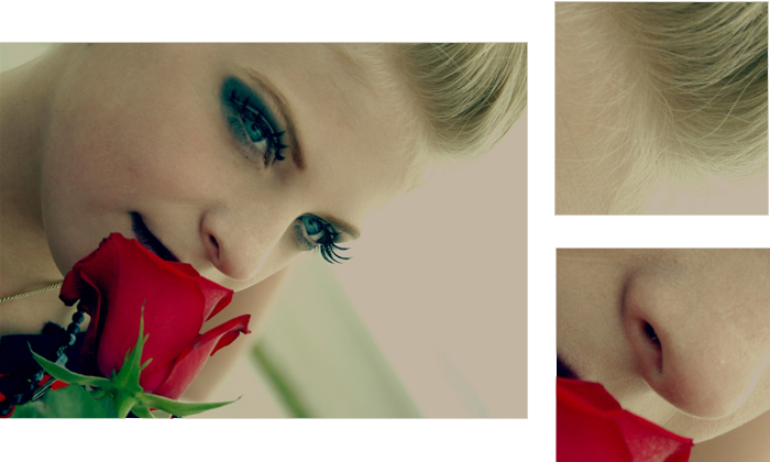
Contrast too low*
Why Contrast Is Important
Contrast is central to perceived quality in all forms of image reproduction. Your eyes can detect a ratio of 10,000:1 in the same scene under ideal conditions, and at least 1000:1 under less ideal conditions. It’s not absolutely necessary to meet that level of contrast to produce acceptable images. Printed photographs, for example, typically have a contrast no greater than 100:1, which most people find reasonable. That said, increasing the contrast further makes images look punchier and more realistic. People talk about images “popping off the screen,” and most of that effect is contrast. At some point there is a law of diminishing returns, but broadly speaking a higher contrast ratio is better.
This immediately raises the question of why you’d ever want to do anything other than cranking Contrast all the way up. If more contrast is better, why not take it all the way up to the maximum possible? The basic reason is simple: because most displays will distort in some way well before the Contrast control reaches maximum.
These days people are used to fixed-pixel displays like LCD, Plasma, and DLP. But the original video display was the Cathode Ray Tube, or CRT. The most common result of setting Contrast too high on a CRT is “blooming,” where small areas of picture get larger as the electron beam loses focus. Thin lines get thick and small bright dots turn into larger bright dots. In addition, the power supply can get overtaxed as the contrast goes up, in some cases resulting in geometry distortion, where straight lines on screen become curved.
So setting Contrast on a CRT is usually a matter of putting up a test pattern with thin lines or boxes that make blooming and geometry easy to see, then raising Contrast until the image starts to bloom or you see curving of straight lines, then lowering Contrast a notch or two below the level where the problem(s) occur.
Figuring out exactly where blooming occurs can be tricky in practice; an excellent display might never bloom, or at least not bloom even with Contrast all the way up. If the power supply is good, you might never see geometry distortion. Alternatively, the display might be badly designed and there might be blooming or geometry distortion even at the lowest Contrast level. There’s also a feature found on many CRTs called “Scan Velocity Modulation,” or SVM, that is intended to improve the sharpness of edges, but also tends to distort the picture geometry. Among other issues, it can make thin white lines thinner and thin black lines thicker. This makes it harder to see blooming and other distortions. Certainly if you own a CRT, if you can turn off SVM, we recommend that you do so. Search the internet for the model number of your display and “SVM,” and you’ll often find forums or web guides to tell you how to enter the service menu and turn it off.
Nowadays with digital displays the most common problem caused by setting Contrast too high is clipping. Modern fixed-pixel displays typically have an absolute maximum brightness they can produce. That maximum is a hard limit, so once the brightest parts of the image are being displayed at the brightest level the display can produce, going any further just causes the upper ranges of brightness levels to collapse so they all appear to be the same (very high) brightness.
Setting Contrast on a fixed-pixel display, then, is simple. Put up a pattern that has patches of near-maximum white on a background of maximum white. Raise Contrast until some of the patches disappear and blend into the background, then lower Contrast until they are visible again.
One important thing that we haven’t yet mentioned is that the video system has two different white levels. The white level that is talked about most often is “reference white.” Reference white is the top of the nominal video range. However, there is room in the video standard for above-reference values, which are sometimes called “whiter than white” or “super white.” This area of the video range is supposed to be reserved for “overshoots” and occasional excursions outside the nominal range. Very little of most video frames strays outside the reference range, but often the stuff that does stray outside the range makes a difference in the image. Most notably, when displaying bright saturated colors and/or highlights on bright white and near-white objects, one or more of the red, green, or blue channels may stray into the overshoot area. For this reason, professional video monitors are always calibrated such that they have room to display the above-reference range.
This is the basic quandary: if you calibrate so that reference white is the brightest level the display can produce, you maximize the contrast ratio, which is measured by comparing reference white to reference black. But you may be missing some amount of picture information, albeit small, that the professionals working on the video saw.
How exactly to resolve this quandary involves considering what you consider most important and what your viewing conditions are. If what you want is the punchiest possible video, or you routinely watch video in a room with a significant amount of light, you may want to consider deliberately calibrating to maximize reference white and clipping the above-reference range. If you want to make your display look as much like the pro monitors used to master video, and you’re viewing the video in a dim or dark room, you’ll almost certainly want to preserve the above-reference range.
You can split the difference if you like. Each additional chunk of brightness above reference white adds a little bit less to the image than the previous chunk, so you might decide to preserve some of the above-reference range but not all. This isn’t inherently wrong. However, it’s worth noting that we nearly always calibrate our displays to preserve the entire above-reference range. We think that most modern displays have enough inherent contrast that sacrificing a small part of it to the above-reference range is worthwhile.
Display Controls vs. Player Controls
In general we recommend calibrating using the controls on the display. That ensures that all the other devices you connect to the display will get the benefit of the calibration. Be aware that not all devices will necessarily output the same levels; if you get the BD player looking great but other devices look too dark or too bright, that suggests that you’ll need to use different settings for those devices, or search the menus of the other devices to see if they have options for changing the output color space or levels. In some cases you just need to ensure that all your devices are set to the same mode. For example, if one device is outputting 4:2:2 Y’CbCr, but another is outputting RGB, that might cause the picture to look different for multiple reasons. The RGB device might be using different levels (such as the so-called “PC levels” of 0 for black and 255 for reference white). The display might have separate calibration settings for Y’CbCr and RGB. Take a look in the menus of both devices looking for settings like “Color Space” or “Black Level” or “Super White” or “Extended Range” or variations on those themes.
The other problem with using the controls on the player is that the player may not be using high enough precision to accurately map the changes you’re making into the output code space. If you’re outputting 24 bit (standard) video (8 bits per channel), then adjusting Contrast on the player will lead to some of the codes either being clipped off or collapsed.
If your player offers a 30-bit or 36-bit mode (10 bits or 12 bits per channel), and your display can accept one or both of those modes, then we recommend using them. If you use one of those higher-bit modes, adjusting video settings on the player is probably going to be workable, though we still recommend starting by getting the display settings as calibrated as possible. When calibrating with the player controls, make sure to view the ramps on the Contrast pattern to look for bands or streaks, just in case the display or player isn’t actually maintaining the extra precision all the way to the display panel.
Calibrating to Absolute Light Level
When broadcast video CRT monitors are calibrated, they are set so that a field of reference white has a specific absolute brightness (usually around 100 cd/m2 (candelas per square meter) or 30 footlamberts). Note that broadcast video monitors are viewed in a dim, but not completely dark, environment. In a completely dark room, half that brightness (50 cd/m2) is fine. If you have a light meter that measures luminance directly, you can do this yourself, but it’s not really the recommended strategy for modern fixed-panel displays. Most of them have limited precision available in their digital processing chips, so usually you want to set Contrast to the highest available level that doesn’t clip. If the final screen brightness is too bright, if your display is a front projector you can often knock it down with a neutral-density filter on the lens or a low-gain screen. If your display has an iris control, you can use it to reduce the overall light level to an acceptable brightness. How much light is too much from a display is subjective and depends on the ambient light level of the room. In a dark room, above 150 cd/m2 is probably pushing it, and in a moderately-lit room above 300 cd/m2 may be too much. In general, the key is that the display shouldn’t appear dazzling or hard to look at when bright scenes are shown. If the screen looks better when you’re wearing sunglasses, it may be too bright.
Using the Contrast Pattern
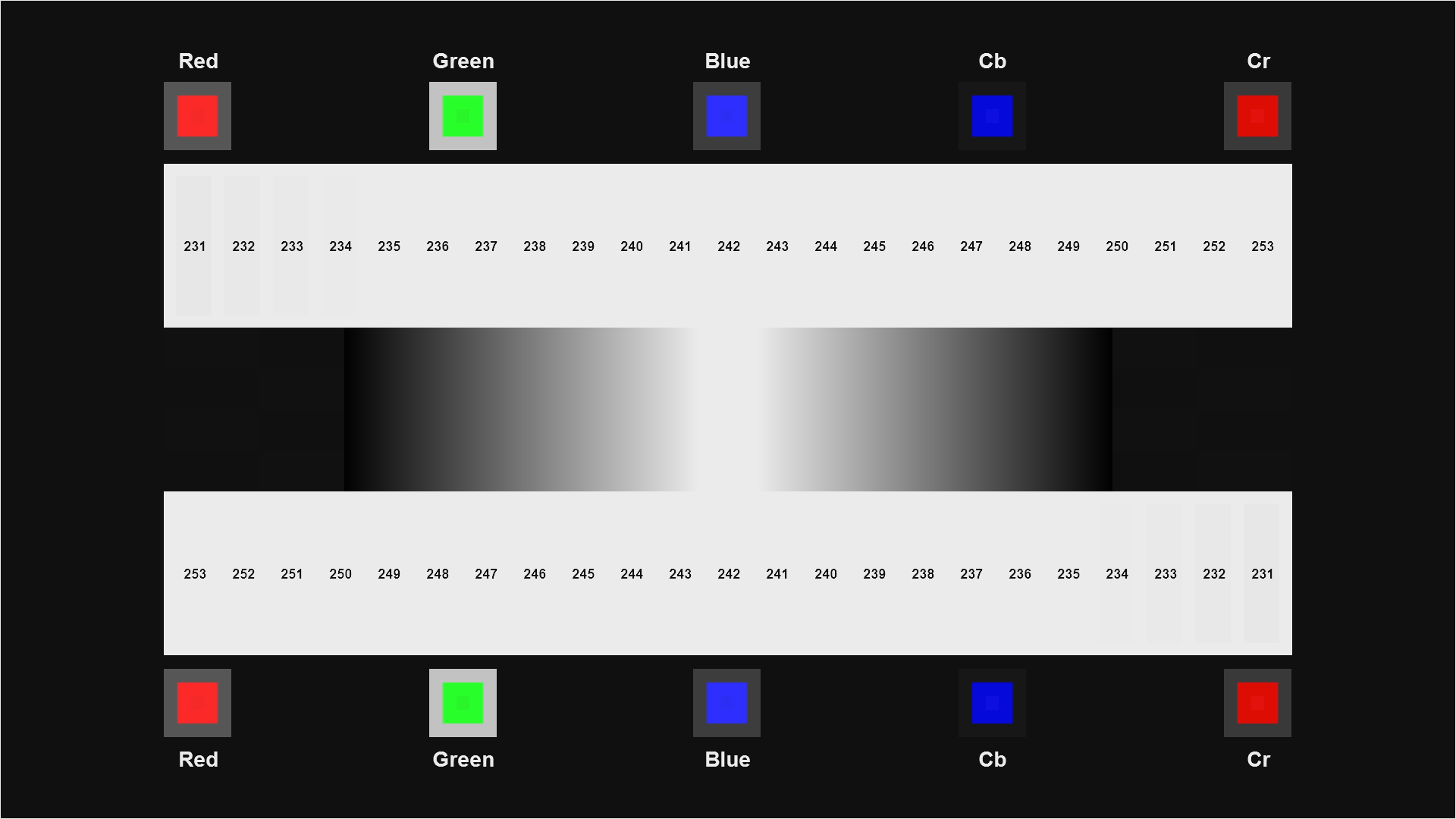
This pattern is designed to calibrate the display to show all of the levels up to peak white (254). If you only want to calibrate up to reference white (or your display or player won’t reproduce values above reference white), you can adjust so all the bars above level 234 disappear. If you want to calibrate to some middle level, pick a bar somewhere between 235 and 253 and calibrate so that bar is visible but the bar above it is not.
The pattern is divided into several sections.
In the middle are two ramps. These are useful for watching for banding, also called “contouring,” while you adjust the Contrast control. See the section below called Other Issues To Watch For for tips on using the ramps.
Ramps with banding (contouring)
Ramps with smooth gradient
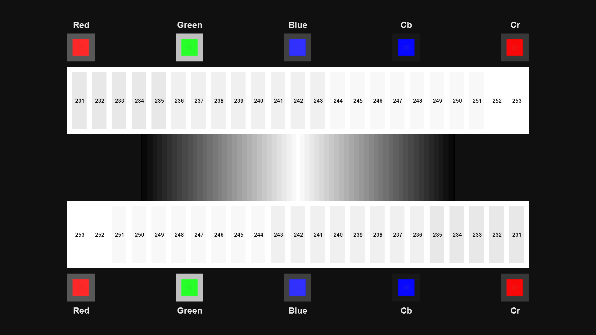
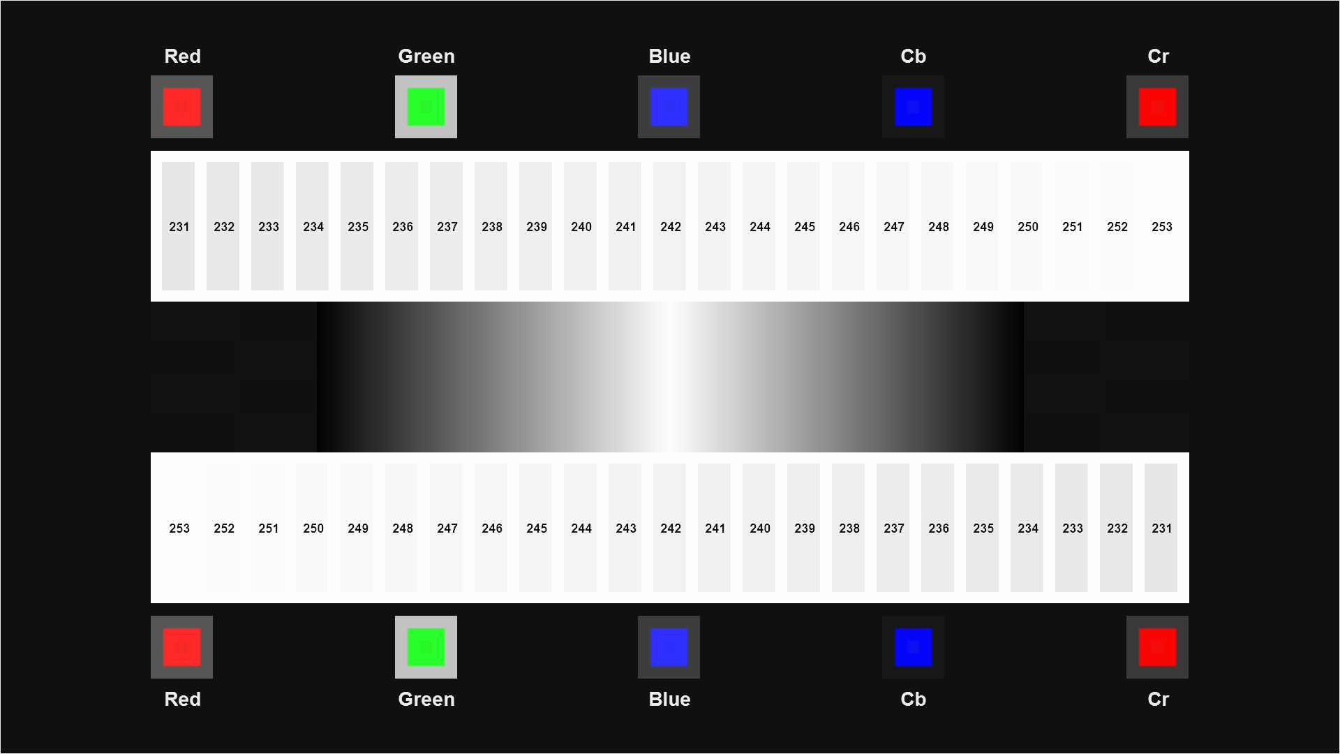
Near the top and bottom are two rows of white bars at levels from 231 to 253 on a background of peak white (254). When nothing is clipped, you will probably be able to just barely make out the 252 bar against the background. If the 253 bar is clearly visible, that suggests that your display doesn’t use the appropriate gamma curve, or possibly that it’s doing some kind of odd sharpening or edge enhancement.
To set white level, put up the pattern and turn down Contrast until all of the white bars are visible, or as many are visible as possible. If not all the bars can be made visible, you may want to check through the settings in your display or player to see if there is a mode switch that can put the device in the proper mode to show or send the entire video range. These modes are often called things like “Level Expansion,” “Super White,” or “Headroom.” You might try changing the output mode on your player, if it offers multiple modes such as “4:2:2,” “4:4:4,” or “RGB.” You may also want to search the internet to see if other people have encountered the problem and fixed it. If you cannot make the above-reference bars appear, then either the display or the player is clipping the levels in a way that can’t be recovered. Until you can fix or replace the problem component, continue calibrating using the levels that are visible.
On the very top and bottom are the quick clipping check boxes. If a particular channel is not being clipped, you will be able to see a smaller, darker square in the middle of each colored square. You may need to get close to see the square. This is so you can see quickly if another channel is being clipped, without having to switch to the Clipping pattern, mentioned below in the Other Issues To Watch For section. It’s not as precise as the Clipping pattern or the Dynamic Range patterns, but it comes in handy to check for obvious clipping problems.
Bars on display that clips above reference white
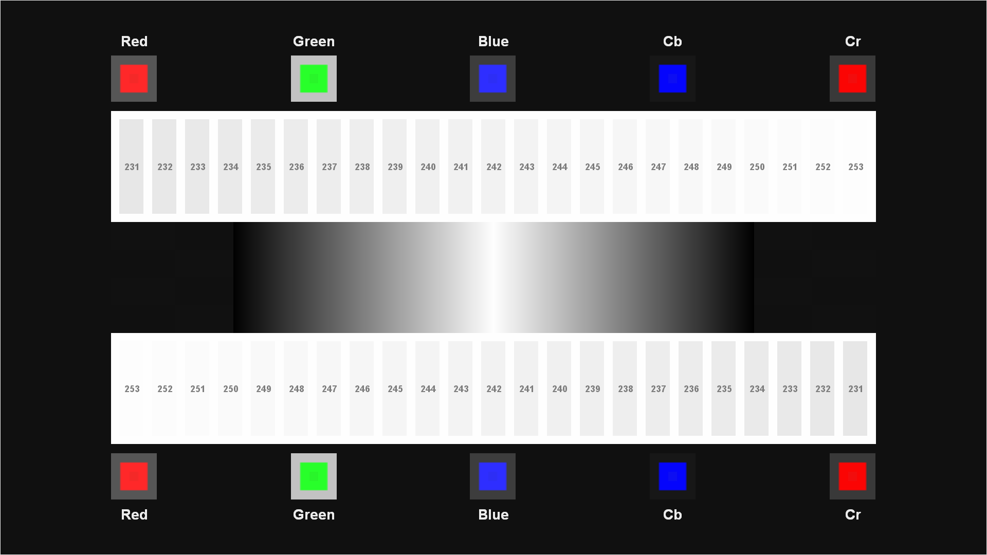
Bars with no clipping
If you are calibrating a DLP, LCD, Plasma, LCOS, or other fixed-pixel digital display, turn up Contrast just until the highest visible bar disappears. Then turn it down again until the bar reappears. This is probably your final calibrated setting, but you should also read the Other Issues To Watch For section below to see if further tweaking is necessary.
Other Issues to Watch For
• After setting Contrast, you may want to bring up the Brightness pattern, to make sure that the left bars continue to be invisible and the right bars are visible (though the fainter of the two may be very faint). If they are not, readjust Brightness, and then come back to this pattern to readjust Contrast. Continue moving between the two calibration operations until both patterns appear correct, or a reasonable happy medium is achieved.
• One problem we see reasonably often in displays is that the Contrast control is implemented using fairly low-precision math. The result is that the various levels in between 0 and maximum are rounded to the nearest displayable level. This can result in contouring in smooth gradients. To check for this, it’s worth looking at a continuous ramp (such as the one in the Contrast pattern) and ensuring that it looks like a gradient and not a series of thin bars. You may want to move Contrast up and down and see if you see bars, bands, or stripes appear or disappear. If there is one setting that is close to the optimal setting and produces a smoother ramp, it’s probably worth compromising on perfect contrast in order to get smoother gradients. If possible, use a Contrast setting lower than optimal rather than higher than optimal, to avoid clipping.
• It’s possible to be able to see all the contrast bars and still be suffering from clipping in one or two of the R, G, and B color channels. To check for this, bring up the Clipping pattern from the Advanced Video->Evaluation section and check that you can see concentric squares of progressively brighter color in each of the large colored squares. If any square or subportion of any square is a solid, even shade of red, green, or blue, then that channel is being clipped. You should check to see if lowering Contrast will bring back all of the subsquares. If it won’t, or you need to turn down Contrast an excessive amount to get all the squares back, then all is not lost. There are other reasons for clipping in individual color channels, such as having the “color” or “saturation” control set too high. We’ll cover that control, and more about the Clipping pattern in future articles.
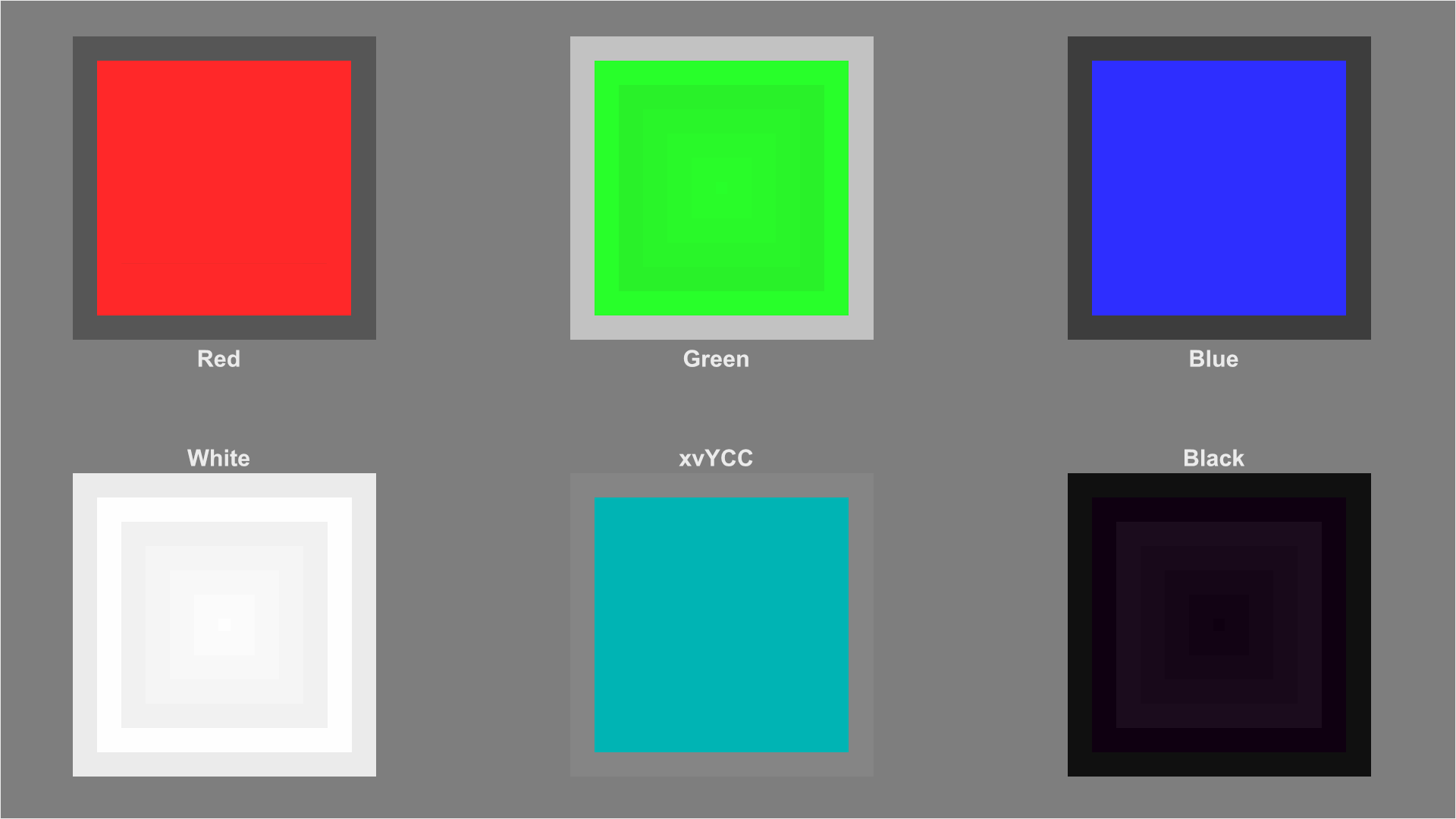
Clipping pattern with red and blue clipped

Clipping pattern with no channels clipped
Conclusion
In the end, it’s a very simple operation. Once you know what to do you can calibrate contrast in about a minute – perhaps longer if you really want to get everything just perfect.
Next up: Setting the Brightness Control.
*Photo by D Sharon Pruitt used under Creative Commons license.