Overview We had several goals building these patterns:
• Build each pattern in the color space and format that made the most sense. For example, if the pattern is for evaluating YCbCr issues, we built the pattern in YCbCr space directly rather than creating it in RGB and converting. This necessitated building our own pattern generation code, as no existing image editing software works in YCbCr natively. Similarly, most of the patterns were generated directly in 4:2:0, which again can’t be created natively by image editors.
• Use the very best algorithms and the highest precision. In most cases, the patterns were generated using 64-bit floating point values for each channel of each pixel, and then converted to 8-bit using special dithering algorithms to preserve dynamic range. Where we needed to anti-alias lines and curves (for example in the sharpness pattern) we oversampled each pixel (again, with custom-written software) by 256x or more to get the smoothest possible edges and contours.
• Build patterns with digital in mind from the beginning. For a long time, all the standard video patterns have been designed for the limitations of analog broadcast. Since our patterns were built using an all-digital signal path and will never be broadcast, we don’t need to conform to FCC bandwidth limitations or roll off high frequencies to avoid causing problems for old CRT displays. All of our patterns are built to use the absolute highest bandwidth available to modern all-digital equipment.
We used the same philosophy for simple patterns as well as complex ones. Every pattern on the disc has something about it that makes it unique, even the basic patterns like PLUGE and Color Bars.
Pluge Low
This is a very simple pattern used to set the brightness control. There are four vertical bars on a background that is reference black (code value 16 in 8-bit video). There is are two bars set to levels below reference black and two set to levels above reference black. In a system where 100% represents reference white, and 0% represents reference black, the four bars are set to -4%, -2%, 2%, and 4%, counting left to right. The idea of the pattern is to set the brightness control until the two left bars are not visible and the two right bars are visible. The original PLUGE generator used only -4% and +4% bars on a black background, but that left a fairly wide range of settings that would look correct. Absolute precision was not considered as important as having a pattern that could be used quickly and easily. Adding a -2% and +2% bar makes the pattern more precise, but a little harder to set, because when the -2% bar disappears the +2% is often just barely visible. Obviously you can just use the outer +/-4% bars and get the same precision as the older pattern. There is also a background checkboard of rectangles that are at digital levels 16 and 17. Level 16 is reference black, so level 17 is just barely gray. When everything is set properly, the checkboard should be either invisible or just barely visible, and then only after letting your eyes get completely adjusted to the dark. On a single-chip DLP projector, if you look closely at the screen when everything is set correctly, you’ll see faint moving noise in the 17-level blocks, and nothing in the 16-level blocks. That’s a good thing, and tells you your black level is right on the money. This pattern (and others on the disc) has the edges of the bars aligned to compression block boundaries. Compression blocks (actually “macroblocks” for the picky) are 16×16 pixels for all common video compression formats. We do this for all the patterns on the disc where it makes sense to do so. It’s worth taking a moment to talk about why. One of the hardest things for a video compressor to encode properly is a hard edge. Video compression is designed to be most efficient at compressing smooth areas of the image. When a compression block contains a hard edge, it requires many bits for the encoder to ensure that the edge continues to be clean and sharp, not soft, and has no extraneous “mosquito noise” around it. Whereas an edge that is on the boundary of two blocks is effectively “free.” It costs nothing to encode, and can’t be ruined by multiple encode/decode passes, as long as the image isn’t shifted or cropped. It’s not strictly necessary to align edges on block boundaries; it is possible to get clean edges anywhere in the image by assigning enough bits to the frame. But this lets us build in a little extra insurance, so no matter how the pattern gets encoded, transcoded, etc. it should stay clean.

Pluge High
This pattern is the same as PLUGE Low, but with a bright window on the screen. This lets you check whether your display will hold the black level constant when it is showing a bright image. Not all displays will. Note that because of the bright reference, your eyes may have more trouble seeing the PLUGE bars. Block out the bright area with your hands and let your eyes get used to the ambient level before trying to evaluate the display’s black level retention. The edges in this pattern are aligned to compression block boundaries.
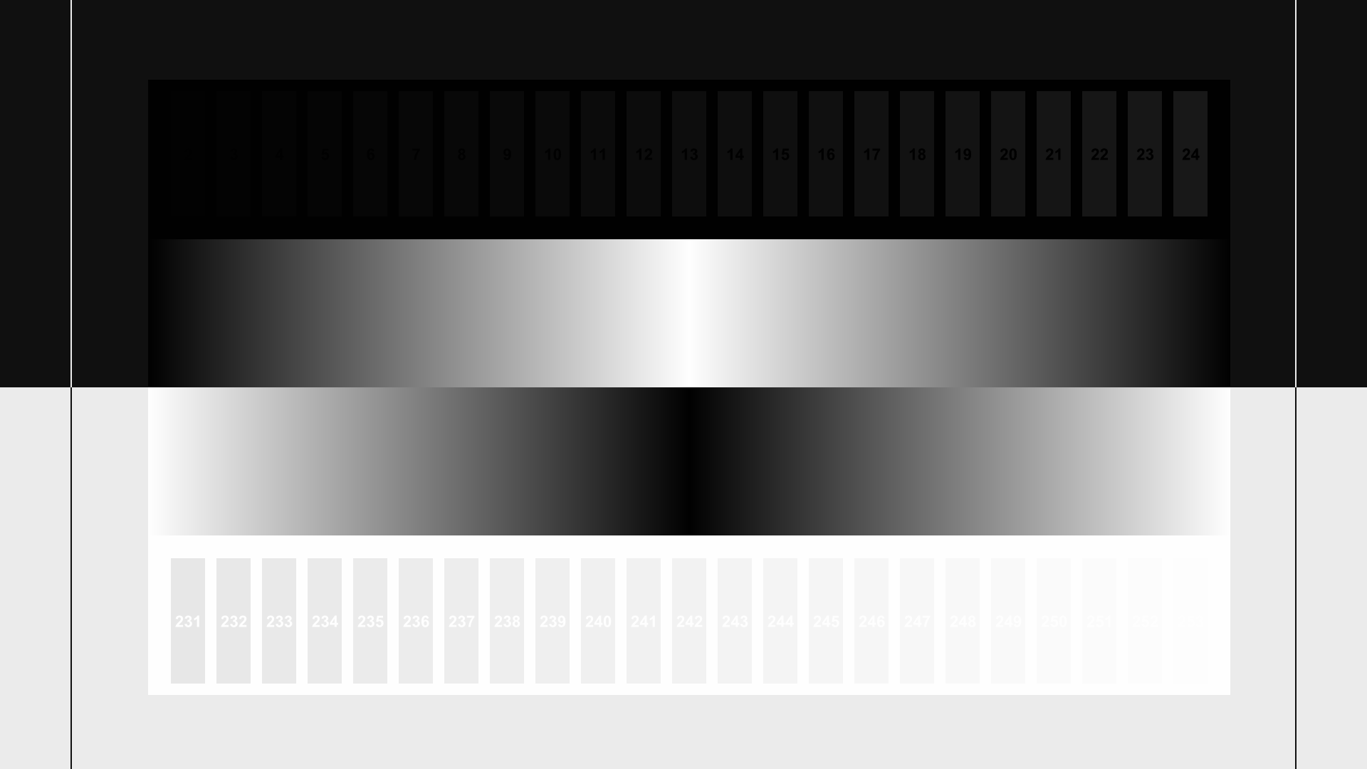
Contrast
This pattern is one of several on the disc that are useful for multiple purposes. We call this a contrast-setting pattern, and it’s quite useful for setting contrast properly, but there are other handy things about it. In the days when CRTs were the dominant display, contrast was usually set to the highest level that didn’t cause geometric distortion of the image or “blooming,” where bright areas would visibly get larger on screen. Clipping was not a common problem, because CRTs just don’t clip until wildly overdriven. With modern fixed-pixel displays, neither geometric distortion nor blooming is a problem. The principal problem is clipping, because they have a hard limit on the brightest level they can display. The common advice is to set the display so that values above reference white are clipped, similar to the way the black level is set so values below reference black are clipped. This is wrong. As mentioned earlier, CRTs never clip under normal circumstances, so all the values above reference white will be reproduced on a CRT, and CRTs are still the standard reference used by professional video technicians. So even though it makes the image just a little bit darker overall, the best advice is to set contrast so all of the above-reference bright values are visible. When contrast is set correctly, all of the light-gray numbered bars near the bottom of the screen should be visible except the rightmost one or two. Theoretically the last one should be near-impossible to distinguish from the background, but in practice often the next-to-last will also be impossible to distinguish from the background, even when everything is set properly. It’s best to turn contrast down until as many of the bars as possible are visible, then turn it up until one of the rightmost bars disappears, then turn it down one notch. You want the contrast to be set to the highest level possible that doesn’t clip any of the picture information. In addition to the contrast-setting bars at the bottom, there are also bars at the top that can be used to check the brightness setting, as well as check that your player is passing all the below-reference black information. If you turn up brightness, you should be able to make all the black bars visible. Once you’ve verified that, you’ll want to turn the brightness back down until only bars 18 and higher are visible, or go back to the PLUGE pattern and reset brightness. The ramps are good for checking that your brightness and contrast settings are being accomplished with sufficient precision to avoid posterization. As you adjust contrast and/or brightness up and down, the ramps should stay smooth and clean and shouldn’t ripple, sparkle, or show any real change. If they do, or they start to look like distinct vertical bands instead of smooth gradients, that’s a sign that the display is doing integer arithmetic to apply the brightness, contrast, and other adjustments, and not using sufficient precision. On some displays, different settings for brightness and contrast produce different levels of posterization. If the ramps look best with the brightness or contrast a notch or two above or below the theoretically perfect setting, our advice is to use that setting, because posterization is much more visible than small amounts of clipping. The edges in this pattern are aligned to compression block boundaries.

Color Bars
This is a classic pattern used since the earliest days of color TV. It’s used to adjust the color and hue settings to compensate for any differential in amplitude caused by analog circuitry between the broadcaster and the TV. Nowadays with digital video (and better controls on analog components) that essentially doesn’t happen, so it’s rare that you even need to adjust these controls. But this pattern can also be used to verify that your display is properly converting YCbCr to RGB without any fudge factors. It used to be common to modify the color decoder (the component that converts from YCbCr to RGB) so reds would get redder. This makes skin tones “pop” on screen. This is less common on modern TVs, but if you want to check such things you need a color bar pattern. To check color decoding, you need to be able to turn off individual RGB channels, or a very good set of colored filters. Colored filters must be chosen carefully and must block out the majority of light from the unwanted channels. In general it’s not recommended to use filters to adjust or check color decoding unless you have high confidence that the filters are excellent. If you are using colored filters, you can check that each filter is good by looking at the bars that turn dark when looking through the filter. All the dark bars should be completely black. If they show any color at all or are not the same brightness level, the filter is not blocking the two color channels it’s supposed to block, and that filter should not be used for fine-tuning color or hue. If the color or hue settings are wildly wrong, then such a filter will allow you to improve on the factory settings, but they will not get you the very best possible settings. When looking at the color bar pattern with only the red, green, or blue channels turned on (or through red, green, or blue filters), you should see that some bars in the top and second row disappear (different bars for each channel) and some bars turn solid red, green, or blue. The brightness of the remaining bars (just in those two rows) should be identical. Bars that touch each other should look identical, though there may be a thin line or border between the two bars. To adjust color and hue, you can use any single channel, though blue is traditional. To check color decoding, you first need to adjust color and hue using one channel, then check that everything looks correct for the other two. If you can’t get all three channels to look correct at the same time, then the color decoder is “fudged.” The edges in this pattern are aligned to compression block boundaries.

HD Color Bars
This is a newer color bar pattern with an extra ramp to check for posterization, and a white reference bar below the main bars to use as a reference for color and hue checking. There is also a more precise PLUGE pattern in the lower right (see our notes on the PLUGE pattern for the reasoning). The edges in this pattern are aligned to compression block boundaries.

Sharpness
Sharpness is important. Having just the right amount of sharpness in a display is essential for getting the most pleasing picture, but oversharpening is just as bad as undersharpening. Unlike brightness, contrast, color, and hue, there is no “perfect” level for sharpness, because it is at least partially perceptual and the perfect amount of sharpness in an image is entirely dependent on a host of factors including display technology, screen size, and how far you normally sit from the screen. The perfect sharpening is the level that makes real, normal edges look clean and sharp without adding visible halos or stairstepping. One problem with some sharpness patterns out there is that they have a certain level of jaggies or halos because of processing artifacts in the software used to produce the pattern. It’s hard to tell the difference between artifacts added by the display and artifacts inherent in the image. Our sharpness pattern has perfectly smooth, artifact-free edges. The edges were antialiased using the best oversampling we could generate, so on a display with no extra sharpening they should look smooth and clean even up close to the screen. As you turn up the sharpness control on the display, you should start to see faint halos around the lines. The diagonals will start to look jagged. Turn sharpness up until the screen looks harsh and oversharpened when viewed from your regular seating position, then turn it down again just until all the lines and curves look smooth again.

Clipping
“Clipping” is when the display (or player) shows the brightest parts of the image as a single uniform brightness. So if you had pixels at levels 252, 253, and 254, they would all look like the same color and/or brightness instead of three different colors or brightnesses. Clipping can happen in the luma (brightness) channel, in video color space, or it can happen in the red, green, or blue channels in display color space. This pattern allows you to see at a glance if there is any clipping going on in any of the four spaces, and in some cases will tell you which device is doing the clipping. When the display is not clipped, you should see concentric squares of different brightness. If you see a solid rectangle, or a few concentric squares with a large square in the center, that shows clipping. If luma is not clipped, but R, G, or B is clipped, that tells you that the display is receiving the entire video signal, but is converting it to out-of-range red, green, and/or blue levels. You can attempt to remedy this problem by turning down contrast until all of the channels are not clipped. If reducing contrast doesn’t resolve the clipping, then the display is fundamentally incapable of displaying the full range of all the color channels. If luma is clipped, but R, G, and B aren’t clipped, your first assumption should be that contrast is set too high. Turn down contrast and see if the clipping goes away. If it doesn’t go away, then the player or display is clipping the high luma range. To figure out whether it’s the player or the display generally requires either test equipment or temporarily substituting a different player and/or display.

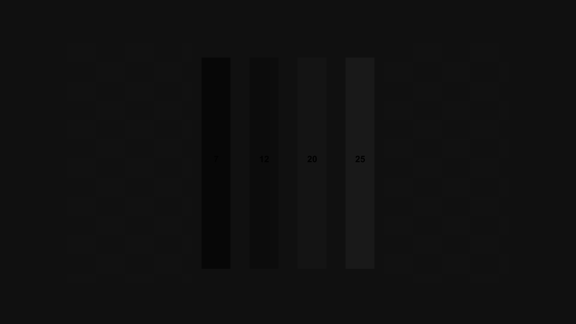
Image Cropping
Not every player or display actually shows you every pixel that is encoded on the disc. This pattern will show you how much of the image is missing. It also allows you make sure the image you’re seeing is centered on the screen. And as a bonus it has a quick gamma check in the center. The gamma check can only be used effectively if you are using a 1080p display with no clipping. If the display is clipping no pixels, you should see a white line at the outermost edge of all of the numbered boxes around the edge of the screen. If some of the boxes are missing the white line near the edge of the screen, that tells you that the edge of the image is clipped off. The largest-numbered box that is missing a white line tells you how many pixels are missing on that edge of the screen. If there are an uneven number of pixels clipped between the left and right, or between the top and bottom, you may want to use the shift controls on your display (if any) to move the image so there is equal clipping on both sides and equal clipping on the top and bottom. Assuming your display is 1080p, and there is no clipping of the image and the image stretches completely from edge to edge of the screen, and the black and white checkerboard in the middle of the screen looks clean and moiré-free, you can check the gamma of your display by checking if the checkerboard pattern in the center of the screen has the same apparent brightness as the gray background of the rest of the screen. If the pattern is brighter or darker than the background, your display is not set to 2.5 gamma. If your display is not 1080p, or the image is scaled in any way, (which would show as moiré and stripes in the checkerboard), then you can’t check the gamma using this pattern.

Chroma Alignment
This pattern is useful for checking all of the following:
• Horizontal alignment of the luma and chroma channels
• Vertical alignment of the luma and chroma channels
• Horizontal alignment of the red, green, and blue channels
• Vertical alignment of the red, green, and blue channels
• Chromatic aberration of the display lens (if the display has a lens)
The problem with most chroma alignment patterns (sometimes called Y/C delay patterns) is that they usually ask you to visually line up a colored edge and a black-and-white edge, which is nearly impossible to do accurately. Chroma and luma have different precision because of 4:2:0 color encoding, so the chroma channel doesn’t necessarily have a sharply defined edge. Depending on the specific upconversion technique used, the chroma edge may vary visually as much as a pixel while still being “correct.” There is no standard for chroma upsampling, so “correct” upsampling is not something that can be judged completely objectively. In trying to solve this problem we hit on the idea of using symmetry. In this pattern, when chroma and luma are aligned the left and right sides of every object in the pattern will be a perfect mirror image of each other. If the chroma is shifted up, down, left, or right relative to the luma, the various picture elements will no longer look symmetrical. This effect works no matter what chroma upsampling approach is used. One other problem with judging chroma alignment is that if the R, G, and/or B alignment is off it throws off the chroma measurements. Similarly, any visible chromatic aberration in the lens can make the chroma look misaligned. So we added the thin crosshairs in the center and at the corners.
• If any of the crosshairs have colored fringes rather than looking solid white, that shows that there is either an RGB convergence issue or there is a chromatic aberration issue.
• If the display doesn’t have a lens, chromatic aberration cannot be a factor. Only rear- and front-projector displays can have chromatic aberration.
• If the display is a single-chip DLP, there cannot be convergence issues, so it must be chromatic aberration.
• If the fringes are not present in the center, but are present in the corners, and the colors are spread out diagonally toward the corners of the screen (i.e. along imaginary lines radiating from the center of the screen) that suggests chromatic aberration in the lens.
• If the display is a three-panel LCD projector, and the colored fringes are spread out diagonally in a clockwise or counterclockwise direction (i.e. perpendicular to imaginary lines that radiate from the center), that suggests that one of the panels is slightly rotated relative to the other two.
• If the fringes are spread out in the same direction on all five crosshairs, that suggests that one or more of the panels are shifted up, down, left, and/or right relative to the others.
• On a flat-panel LCD or plasma display, if you get very close to the display the crosshairs will appear to have blue fringes on the left and red on the right, or vice-versa. This is normal and is just the way the panel is designed.
If your display has aberration or convergence issues, then only chroma shifts that are larger than the underlying convergence or aberration issues in that part of the screen are clearly and unambiguously luma/chroma misalignment.

Dynamic Range High
This is essentially just the high range of the Contrast pattern. It’s handy when you’re validating dynamic range with a waveform monitor, because there are fewer distracting elements. For setting and validating contrast visually, this pattern and the Contrast pattern are equally useful.

Dynamic Range Low
As with the other Dynamic Range pattern, this pattern is here primarily for use with a waveform monitor.

11 Step Crossed Gray Scale
This pattern is useful for checking output levels using a waveform monitor. For visual setting and validating of brightness and contrast, the Contrast and PLUGE Low patterns are better.
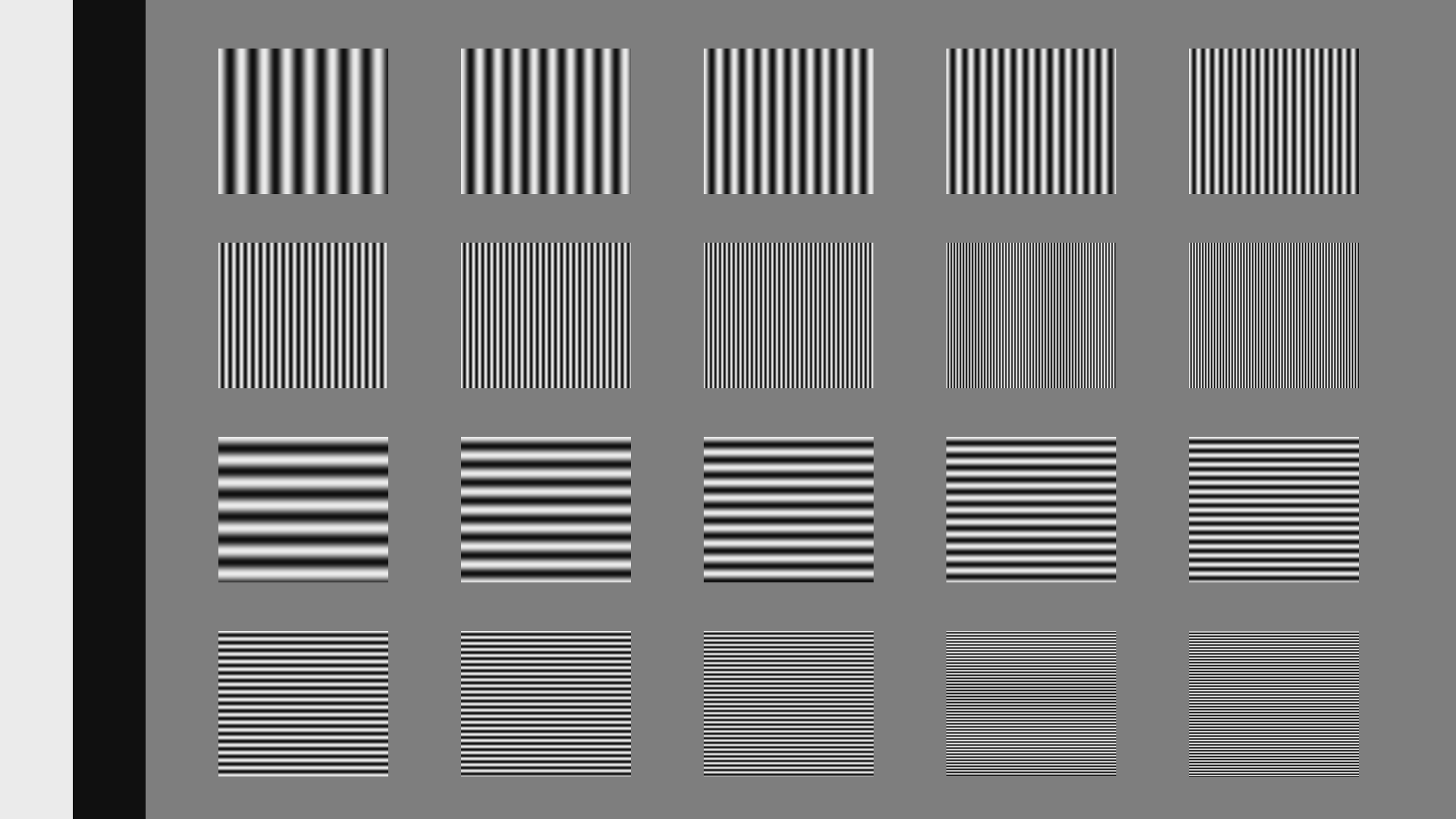
Luma Multiburst
The multiburst pattern was originally used in analog broadcast to characterize and measure the high-frequency rolloff that happens in all analog transmission and processing. With modern all-digital signal paths, it’s rare that the multiburst is useful. But it does come in handy when you know your display is scaling the image, and you want to see how the scaling affects the image. Each burst has a wavelength that is an even number of pixels. The thinnest lines are a 2-pixel wavelength, meaning that the sine wave takes two pixels to go through a single cycle. The next thinnest are 4 pixels wide, and the next are 6 pixels, and so forth. If the display is scaling the image down from 1080p to 720p (or a similar resolution like 768p), you should expect that the highest frequency multibursts (the ones with the thinnest lines) should turn an even gray shade. The next highest should still be visible, though they may have some visible variation in line thickness. All the rest of the bursts should look clean.
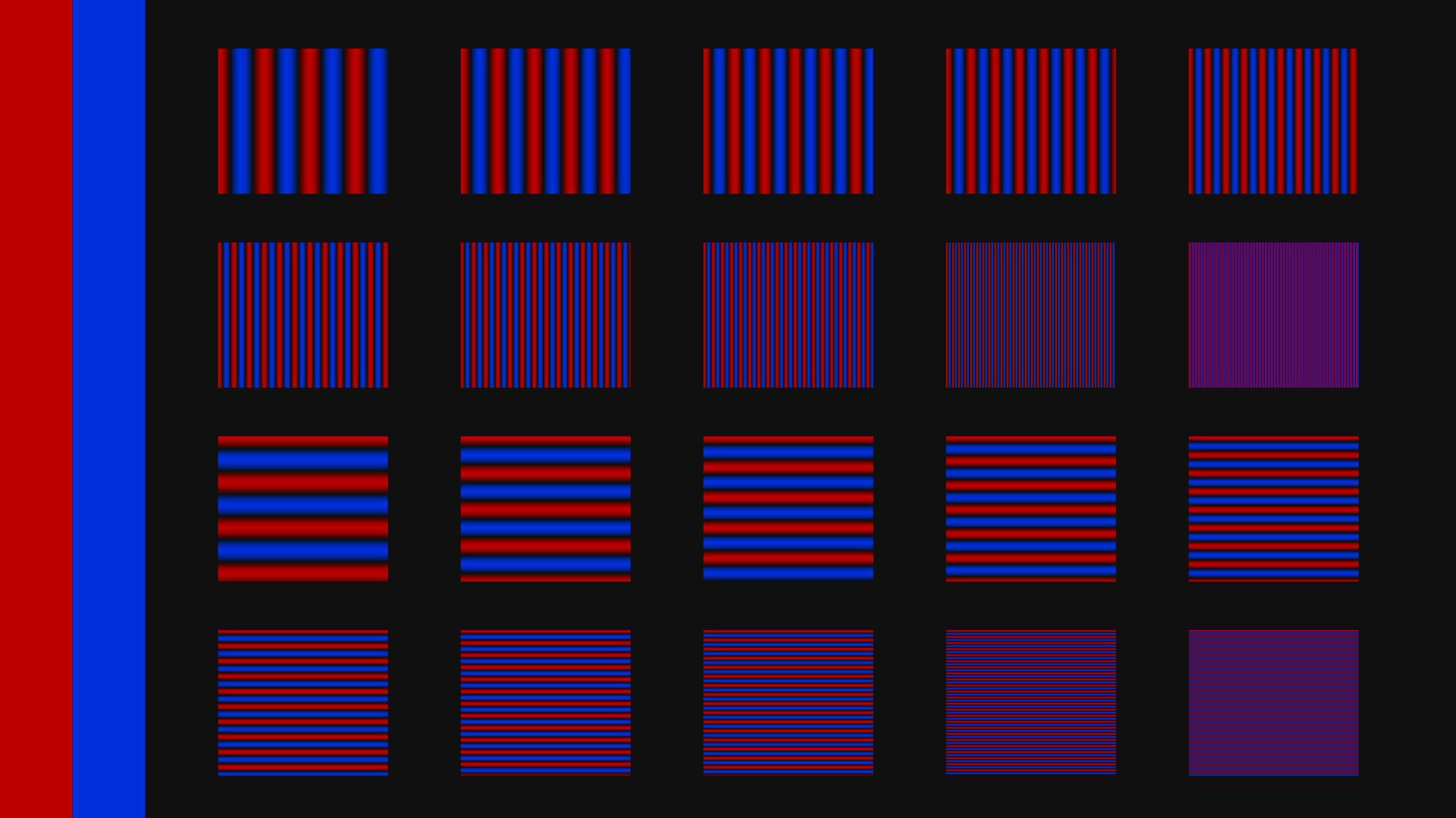
Chroma Multiburst
This pattern is the equivalent to the Luma Multiburst pattern, but for chroma. Because chroma is upsampled when converting 4:2:0 YCbCr to RGB, in a sense every display scales this pattern, even a native 1080p display. In some cases the player scales the chroma vertically to produce 4:2:2 YCbCr, and then the display scales it horizontally while converting to RGB. Or the player may output RGB, in which case the player is doing the chroma scaling. For players that have different output options over HDMI, you can change them while viewing this pattern and see the differences in how the player and the display handle the chroma channel. The individual sine waves in the center of each burst should look even, with no color shifts or intensity shifts on either side of the peaks. The waves should look smooth and not posterized. If the display is a 720p display, it should be possible for it to show all of the bursts cleanly, though the thinnest lines may look somewhat uneven. If the last burst turns gray, it tells you that the display is scaling the image down in YCbCr, which produces a slightly lower quality image than converting the 1080p signal to RGB and then scaling it to the display resolution.

Luma Zone Plate
This pattern is in a sense a variation on the multiburst. The entire screen is turned into a large frequency sweep, covering every angle and frequency of interest. It’s a good way to check at a glance overall luma reproduction, and it’s not a bad pattern to check focus with. It is not possible to reproduce all of the highest frequencies cleanly at every angle, but the centermost 1/3 of the screen or so should look smooth and clean, with the contours getting more and more stairstepped and less smooth as you move toward the edges of the screen. There will be false circular contours toward the edges of the screen looking like ghostly echoes of the center of the screen – if these contours look egg-shaped or oval, or if the false contours take up more than 1/8 of the screen height, something bad is happening to the image. The far edges of the screen should have a very small, almost unnoticeable falloff in brightness. If the brightness falloff is large and easily seen, that’s not as good. If the display is a 720p display, the outer edges of the screen should turn gray, and the transition should be smooth. If there are large bright or dark patches near where the sweep turns gray, that’s bad.

Chroma Zone Plate
Like the chroma multiburst, this is a good pattern to check overall chroma reproduction and scaling. The center third or so of the screen should be clean and smooth, and you should still see full color all the way out to the edges (at least on a 1080p display). On a 720p display, it is possible to get full color all the way to the edge. If the edges of the screen turn gray, that suggests that the 1080p->720p scaling is happening early, before the conversion to RGB, which is less optimal.

Chroma Upsampling Error
This pattern is designed to make it easy to check if the chroma upsampling being used in the MPEG decoder has the (in)famous chroma upsampling error, or “chroma bug.” For more details about the error and the underlying causes, read the article we wrote about it on the Secrets of Home Theater and High Fidelity web site: http://www.hometheaterhifi.com/volume_8_2/dvd-benchmark-special-report-chroma-bug-4-2001.html If the player is upsampling the chroma properly, the diagonal lines should look smooth and clean. If it isn’t, the diagonals will be jagged and have visible zigzags when viewed up close. You can also use the chroma zone plate to look for chroma error, but most people find it easier to spot on this pattern.
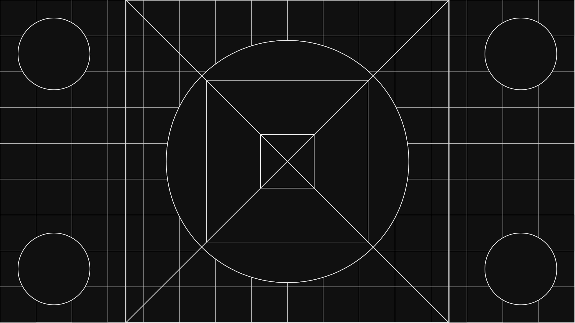
Geometry & PIP Geometry
These patterns are designed to check that the display is properly set to 16×9 ratio, and that 4×3 content is being rendered without distortion in the center of the 16×9 area. The circles and squares should be the same height and width everywhere in the image. If they are not, you’ll want to adjust the image scaling, which may be in the service menu of the display.
Deinterlacing Clips

Source Adaptive
These clips test the ability of the deinterlacer in the display and/or player to detect film-sourced content and reconstruct the original film frames. Both the wedge pattern and the real-world content were chosen to show clearly when the deinterlacer is in film-reconstruction mode and when it is in video-deinterlacing mode. In film-reconstruction mode, the wedge should have minimal moiré, and you should be able to see individual black and white pixels at the tip of the horizontal wedge. In the racecar clip, the bleachers should have no distracting moiré. When the deinterlacer drops to video mode, you’ll see lots of moiré in the wedge and/or the bleachers, and the tip of the horizontal wedge will either turn gray or flicker. All of the pulldown cadences are real cadences that come up in real film-sourced content, and all of them are “fair” in the sense that there is enough information for the deinterlacer to detect that the frames are originally from a film source. The very best deinterlacers will stay in film mode continuously through all of the test sequences. To create the various film-to-video pulldown patterns, we created our own pulldown generating software that we fed perfect progressive content into on one end, and got back the exact cadences we needed on the other. We used the same software to generate unusual edits where the pulldown sequence is interrupted, or a section of it is skipped over as a result of an edit in the video domain.

Edge Adaptive
These clips are primarily for testing the ability of a deinterlacing chip to upconvert video content to progressive while minimizing jaggies and stairstepping. The very best chipsets use an edge-sensitive scaling method when they need to take a single field and scale it to a full frame. These patterns will tell you if your deinterlacing chip is doing so, and how well it manages to reduce jaggies on edges without adding extra artifacts that weren’t there in the original image. The mixed film and video test clip is designed to test how well the deinterlacer handles content where video material (the scrolling text) is overlaid over film-sourced content. Some deinterlacers will detect the 2-3 pulldown pattern of the film material and use film-reconstruction mode, which will cause combing artifacts in the scrolling text. The best deinterlacers will recognize that portions of the image are not film-sourced and correctly use video deinterlacing techniques for the whole frame.